Styling
This SDK lets you adjust the components styling so that they can be naturally inserted in your app without confusing the end user.
Components styling can be customized by either:
- Passing a whole template and mapping it to the controller inputs/outputs
- Overriding the style properties
A combination of both ways can be used. Note that in this case, the default style variables won't be taken into account
Overriding style properties
You can globally customize styles by overriding some classes it will be applied to all components. There are several types of properties that can be overridden: Colors, Wording, Typography, Icons / Images, & Dimensions
- Component styling overrides global styling
- Properties that aren't overriden will keep their default values defined by Mealz in the SDK
Colors
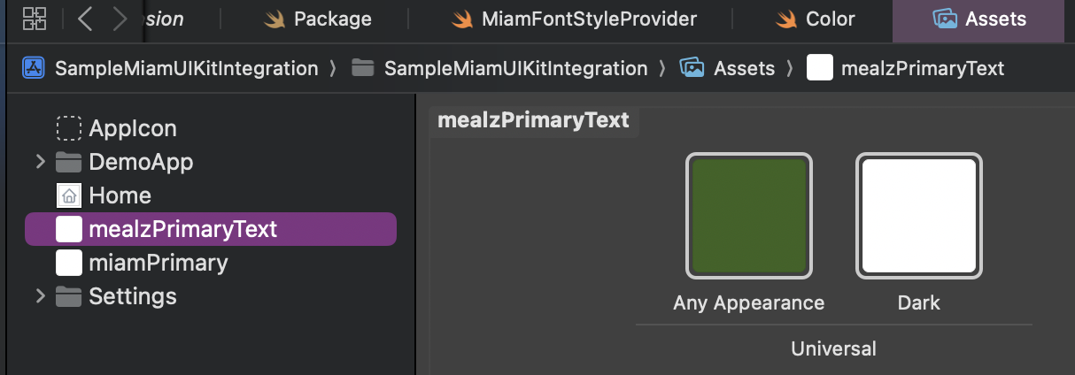
Colors can be globally overriden by redefining them in your main assets file.
For example, adding a new Color, mealzPrimaryText will set all components using Color.mealzColor(.primaryText) to your new color.
Exhaustive color list and default values 👇
| Name | Default LightMode Color | Default DarkMode Color |
|---|---|---|
| mealzPrimaryText | mealzDarkestBlue | mealzLightGray |
| mealzPrimary | mealzDarkBlue | mealzLightestGray |
| mealzBorder | mealzLighterGray | mealzWhite |
| mealzLightBackground | mealzLightestGray | mealzWhite |
| mealzDanger | mealzBurgundy | |
| mealzAuxiliary | mealzMustard | |
| mealzSuccess | mealzGreen | |
| mealzWarning | mealzBrownishYellow | |
| mealzErrorBackground | mealzSalmon | |
| mealzDarkBlue | #23748F | |
| mealzDarkerBlue | 007D92 | |
| mealzDarkestBlue | 1F3543 | |
| mealzLightBlue | BDD4DC | |
| mealzLighterBlue | B52743 | |
| mealzLightestBlue | 42A3A2 | |
| mealzDarkGray | 565655 | |
| mealzDarkerGray | 4A545D | |
| mealzDarkestGray | 2f3236 | |
| mealzLightGray | EAEAEA | |
| mealzLighterGray | D9DDE0 | |
| mealzLightestGray | EAEAEA | |
| mealzWhite | F9FBFD | |
| mealzUnpureWhite | FDFDFD | |
| mealzRed | E61745 | |
| mealzBurgundy | 9F1528 | |
| mealzPinkishRed | 42A3A2 | |
| mealzSalmon | FCE2D3 | |
| mealzMustard | 42A3A2 | |
| mealzBrownishYellow | FFDAA2 | |
| mealzGreen | 28760D |
Wording
To update the text, you must update the I18n Resolver.
Icons / Images
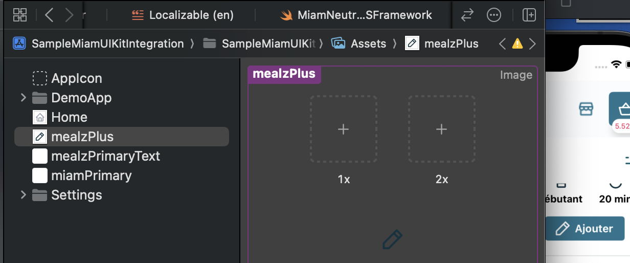
Icons can be globally overriden by redefining them in your main assets file.
For example, adding a new Icon, mealzPlus will set all components using Image.mealzIcon(icon: .plus) to your new icon.
Exhaustive icon list and default values 👇
| Name | Default icon |
|---|---|
| mealzAlert |  |
| mealzArrow |  |
| mealzBasket |  |
| mealzCaret |  |
| mealzCheck |  |
| mealzChefHat |  |
| mealzCutley |  |
| mealzEdit |  |
| mealzFeelingBlue |  |
| mealzFilters |  |
| mealzGuests |  |
| mealzHeart |  |
| mealzHeartFilled |  |
| mealzHome |  |
| mealzKnife |  |
| mealzMealPlannerCTA |  |
| mealzMenu |  |
| mealzMinus |  |
| mealzPan |  |
| mealzPlus |  |
| mealzReset |  |
| mealzSearch |  |
| mealzShop |  |
| mealzSwap |  |
| mealzTime |  |
| mealzTrash |  |
| mealzUser |  |
| mealzUserAdd |  |
New templating system
In version 4.0.0 we have moved away from the Template singleton. It has been replaced by protocols that you will need to implement.
All views used in the meal planner are implemented using the new templating system.