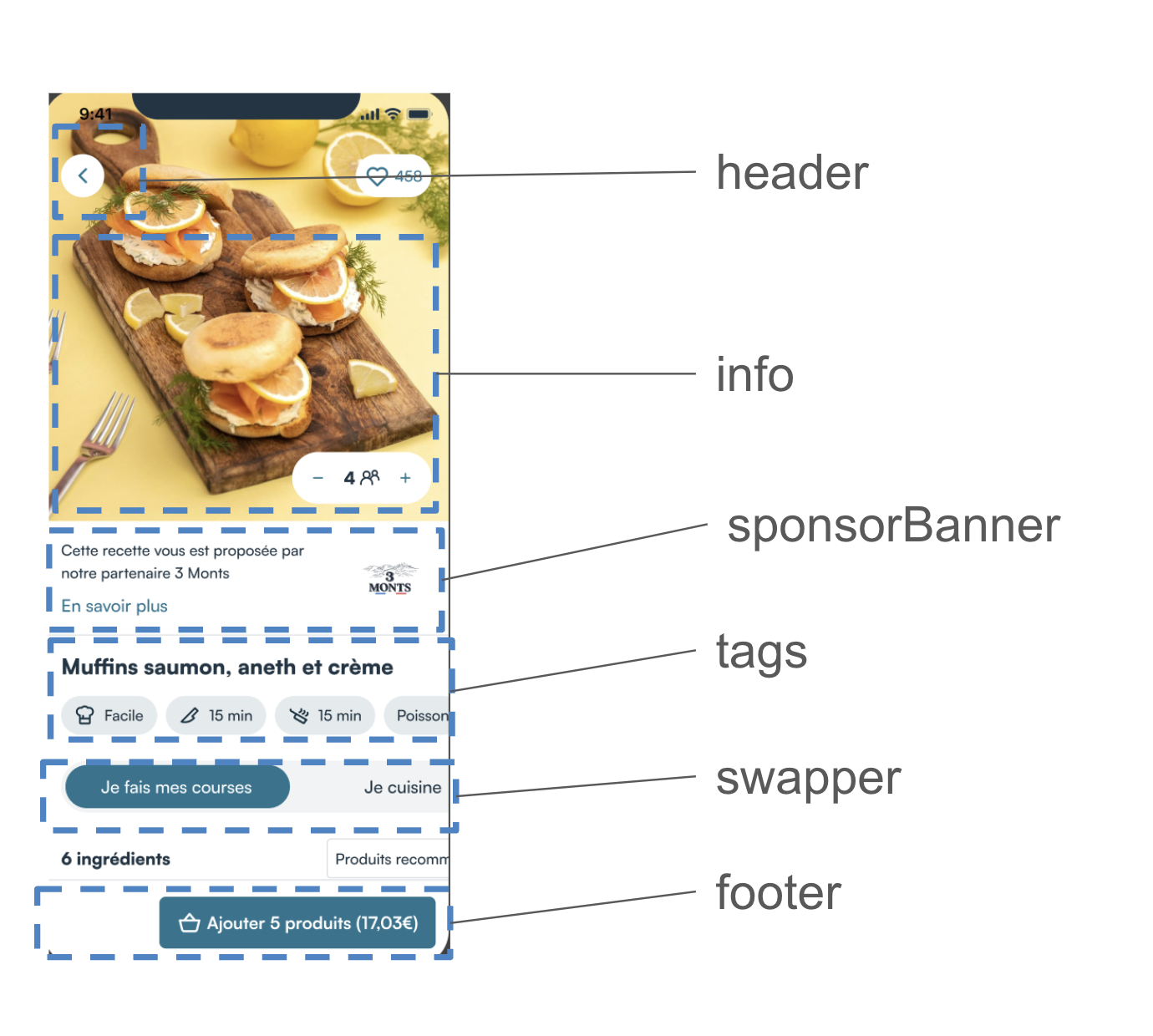
RecipeDetail customization
RecipeDetails is one of the most customizable components, it has two customization states: success & loading:
Loading
Loading is of type LoaderConfig. You can create a custom template for RecipeDetails or otherwise the default template defined in defaultViews will be used.
LoaderParameters is an empty object for now, but tomorrow we'll be able to add properties to it, in order to avoid breaking changes in future versions.
object LoaderParameters
Success
Success state contains 12 customizable slots and one configuration field :
Full customisation setting
If you want to fully customize this component we recommend copying the code into your Mealz template configuration. You can remove the code you do not overwrite.
recipeDetail{
    success {
        header {
            view = MyCustomRecipeDetailHeader()
        }
        info {
            view = MyCustomRecipeDetailInfo()
        }
        sponsorBanner {
            view = MyCustomRecipeDetailSponsorBanner()
        }
        tag {
            view = MyCustomRecipeDetailTags()
        }
        swapper{
            view = MyCustomRecipeDetailSwapper()
        }
        footer {
            view = MyCustomRecipeDetailSuccessFooter()
        }
        productListHeader {
            view = MyCustomRecipeDetailProductListHeader()
        }
        products {
            success  {
                view = MyCustomRecipeDetailProductSuccess()
            }
            loading {
                view = MyCustomRecipeDetailProductLoading()
            }
            ignore {
                view = MyCustomRecipeDetailProductIgnore()
            }
        }
        oftenDeleted {
            header  {
                view = MyCustomRecipeDetailOftenDeletedHeader()
            }
            product {
                view = MyCustomRecipeDetailOftenDeletedProduct()
            }
        }
        unavailable {
            header  {
                view = MyCustomRecipeDetailUnavailableHeader()
             }
            product {
                view = MyCustomRecipeDetailUnavailableProduct()
            }
        }
        ingredients {
            view = MyCustomRecipeDetailIngredients()
        }
        steps {
            view = MyCustomRecipeDetailSteps()
        }
        gapBetweenProducts = 8 // default value
    }
    loading {
        view = MyCustomRecipeLoading()
    }
}
class MiamTemplateManager {
    init {
        MiamTheme.Template
        {
         // <---- copy above code here
        }
    }
}
Header
The Header is the first customizable component on the RecipeDetail at the very top of the page;
to create your own recipe detail header you create a class that implements RecipeDetailHeader
- MyCustomRecipeDetailHeader.kt
- example
}
import ai.mealz.sdk.components.recipeDetail.success.header.RecipeDetailHeader
import ai.mealz.sdk.components.recipeDetail.success.header.RecipeDetailHeaderParameters


class MyCustomRecipeDetailHeader: RecipeDetailHeader {

    @Composable
    override fun Content(params: RecipeDetailHeaderParameters) {
        // Your custom design here

    }
}
import ai.mealz.sdk.components.recipeDetail.success.header.RecipeDetailHeader
import ai.mealz.sdk.components.recipeDetail.success.header.RecipeDetailHeaderParameters


class MyCustomRecipeDetailHeader: RecipeDetailHeader {
    @Composable
    override fun Content(params: RecipeDetailHeaderParameters) {

        Row(
            horizontalArrangement = Arrangement.SpaceBetween,
            verticalAlignment = Alignment.CenterVertically,
            modifier = Modifier
                .background(color = if (params.scrollPosition > 900) Colors.white else Color.Transparent)
                .fillMaxWidth()
        ) {
            Box(Modifier.padding(16.dp)) {
                Surface(
                    Modifier
                        .size(36.dp)
                        .align(Alignment.Center),
                    shape = CircleShape,
                    color = Colors.white,
                    elevation = 1.dp
                ) {}
                Image(
                    painter = painterResource(ai.mealz.sdk.ressource.Image.toggleCaret),
                    contentDescription = null,
                    modifier = Modifier
                        .align(Alignment.Center)
                        .size(24.dp)
                        .padding(end = 4.dp)
                        .rotate(180f)
                        .clickable { params.closeDialogue() }
                )
            }
            if (params.scrollPosition > 900) {
                AnimatedVisibility(
                    visible = true,
                    modifier = Modifier.weight(1f)
                ) {
                    Text(
                        text = params.title, Modifier.weight(1f),
                        textAlign = TextAlign.Left,
                        style = subtitleBold
                    )
                }
            } else {
                Spacer(modifier = Modifier.weight(1f))
            }
            if (params.isLikeEnabled) {
                Box(Modifier.padding(16.dp)) {
                    LikeButton(recipeId = params.recipeId).Content()
                }
            }
        }
    }
}
Header params
data class RecipeDetailHeaderParameters(
    val title: String,
    val recipeId: String,
    val scrollPosition: Int, // of the whole page below
    val isLikeEnabled: Boolean,
    val closeDialogue: () -> Unit
)
info
To create your own recipe detail info template you have to create class that implement RecipeDetailInfo
- MyCustomRecipeDetailInfo.kt
- example
import ai.mealz.sdk.components.recipeDetail.success.info.RecipeDetailInfo
import ai.mealz.sdk.components.recipeDetail.success.info.RecipeDetailInfoParameters


class MyCustomRecipeDetailInfo: RecipeDetailInfo {

    @Composable
    override fun Content(params: RecipeDetailInfoParameters) {
        // Your custom design here

    }
}
import ai.mealz.sdk.components.recipeDetail.success.info.RecipeDetailInfo
import ai.mealz.sdk.components.recipeDetail.success.info.RecipeDetailInfoParameters


class MyCustomRecipeDetailInfo: RecipeDetailInfo {

    @Composable
    override fun Content(params: RecipeDetailHeaderParameters) {
        params.recipe.attributes?.let { attributes ->
            Box {
                AsyncImage(
                    model = attributes.mediaUrl,
                    contentDescription = "Recipe Image",
                    contentScale = ContentScale.Crop,
                    modifier = Modifier
                        .height(280.dp)
                        .fillMaxWidth()
                )
                if (params.isLikeEnable) {
                    Row(
                        horizontalArrangement = Arrangement.End,
                        verticalAlignment = Alignment.CenterVertically,
                        modifier = Modifier
                            .padding(16.dp)
                            .fillMaxWidth()
                    ) {
                        LikeButton(RectangleShape, recipeId = params.recipe.id).Content()
                    }
                }
                if (params.showGuestCounter) {
                    Box(
                        Modifier
                            .align(Alignment.BottomEnd)
                            .padding(16.dp)
                    ) {

                        TemplateDI.recipeDetail.success.info.counter?.view?.Content(
                            params = CounterParameters(
                                initialCount = params.guestCount,
                                isDisable = params.isUpdating,
                                isLoading = params.isUpdating,
                                onCounterChanged = { counterValue -> params.updateGuest(counterValue) },
                                minValue = 1,
                                maxValue = 99
                            )
                        ) ?: TemplateDI.defaultViews.counter?.view?.Content(
                            params = CounterParameters(
                                initialCount = params.guestCount,
                                isDisable = params.isUpdating,
                                isLoading = params.isUpdating,
                                onCounterChanged = { counterValue -> params.updateGuest(counterValue) },
                                minValue = 1,
                                maxValue = 99
                            )
                        )
                    }
                }
            }
        }
    }
}
Info params
data class RecipeDetailInfoParameters(
    val recipe: Recipe, // full recipe
    val guestCount: Int, // number of personne sharing the meal
    val isUpdating: Boolean, // true is you should disable button
    val isLikeEnable: Boolean, // if true you can show like button
    val showGuestCounter: Boolean, // it true you should show guest counter
    val updateGuest: (Int) -> Unit, // to call when changing the number of guest
    val closeDetail: () -> Unit // close this view
)
SponsorBanner
To create your own recipe detail sponsor banner template you create a class that implements RecipeDetailSponsorBanner
- MyCustomRecipeDetailSponsorBanner.kt
- example
import ai.mealz.sdk.components.recipeDetail.success.sponsorBanner.RecipeDetailSponsorBanner
import ai.mealz.sdk.components.recipeDetail.success.sponsorBanner.RecipeDetailSponsorBannerParameters


class MyCustomRecipeDetailSponsorBanner: RecipeDetailSponsorBanner {

    @Composable
    override fun Content(params: RecipeDetailSponsorBannerParameters) {
        // Your custom design here

    }
}
import ai.mealz.sdk.components.recipeDetail.success.sponsorBanner.RecipeDetailSponsorBanner
import ai.mealz.sdk.components.recipeDetail.success.sponsorBanner.RecipeDetailSponsorBannerParameters


class MyCustomRecipeDetailSponsorBanner: RecipeDetailSponsorBanner {

    @Composable
    override fun Content(params: RecipeDetailSponsorBannerParameters) {
       Row(
            horizontalArrangement = Arrangement.SpaceBetween,
            verticalAlignment = Alignment.CenterVertically,
            modifier = Modifier.background(color = Color.Transparent)
        ) {
            Box(Modifier.padding(16.dp)) {
                Surface(
                    Modifier
                        .size(36.dp)
                        .align(Alignment.Center),
                    shape = CircleShape,
                    color = ai.mealz.sdk.theme.Colors.white,
                    elevation = 1.dp
                ) {}
                Image(
                    painter = painterResource(ai.mealz.sdk.ressource.Image.toggleCaret),
                    contentDescription = null,
                    modifier = Modifier
                        .align(Alignment.Center)
                        .size(24.dp).padding(end = 4.dp)
                        .rotate(180f)
                        .clickable { params.closeDialogue() }
                )
            }
        }
    }
}
SponsorBanner params
data class RecipeDetailInfoParameters(
    val sponsor: Sponsor, // all usefull info is inside attributes field
    val openSponsorDetail: (sponsor: Sponsor) -> Unit // navigate to sponsor presentation page
)
SponsorBanner ressources
you can replace and reuse string ressources if you want to take advantage of our internationalisation system
ex : Localisation.sponsorBanner.sponsorBannerSpeach.localised
| Name | Ressource ID | Value Fr | Value Eng |
|---|---|---|---|
| sponsorBannerSpeach | com_miam_sponsor_banner_speach | Cette recette vous est proposée par notre partenaire | This recipe is brought to you by our partner |
| sponsorBannerMoreInfo | com_miam_sponsor_banner_more_info | En savoir plus | Read more |
Tags
To create your own recipe detail tags template you create a class that implements `RecipeDetailSuccessTag
- MyCustomRecipeDetailTags.kt
- example
import ai.mealz.sdk.components.recipeDetail.success.header.RecipeDetailSuccessTag
import ai.mealz.sdk.components.recipeDetail.success.header.RecipeDetailSuccessTagParameters


class MyCustomRecipeDetailTags: RecipeDetailSuccessTag {

    @Composable
    override fun Content(params: RecipeDetailSuccessTagParameters) {
        // Your custom design here

    }
}
import ai.mealz.sdk.components.recipeDetail.success.header.RecipeDetailSuccessTag
import ai.mealz.sdk.components.recipeDetail.success.header.RecipeDetailSuccessTagParameters


class MyCustomRecipeDetailTags: RecipeDetailSuccessTag {

    @Composable
    override fun Content(params: RecipeDetailSuccessTagParameters) {
        Column(Modifier.padding(12.dp), verticalArrangement = Arrangement.spacedBy(16.dp)) {
            Row(Modifier.fillMaxWidth()) {
                Text(
                    text = params.title,
                    modifier = Modifier
                        .fillMaxWidth()
                        .padding(horizontal = 16.dp),
                    textAlign = TextAlign.Left,
                    style = ai.mealz.sdk.theme.Typography.subtitleBold
                )
            }
            RecipeDifficultyAndTiming(
                params.difficulty,
                params.preparationTime,
                params.cookingTime,
            )
        }
    }

      @Composable
    fun RecipeDifficultyAndTiming(
        difficulty: RecipeDifficulty,
        preparationTime: Duration?,
        cookingTime: Duration?,
    ) {
        Row(
            verticalAlignment = Alignment.CenterVertically,
            horizontalArrangement = Arrangement.spacedBy(16.dp),
        ) {
            Time(ai.mealz.sdk.ressource.Image.miamPreparation, preparationTime)
            Time(ai.mealz.sdk.ressource.Image.miamCook, cookingTime)
            when (difficulty) {
                RecipeDifficulty.Easy -> RecipeDifficulty(ai.mealz.sdk.ressource.Image.miamDifficulty, Localisation.recipe.lowDifficulty.localised)
                RecipeDifficulty.Medium -> RecipeDifficulty(ai.mealz.sdk.ressource.Image.miamDifficulty, Localisation.recipe.mediumDifficulty.localised)
                RecipeDifficulty.Hard -> RecipeDifficulty(ai.mealz.sdk.ressource.Image.miamDifficulty, Localisation.recipe.highDifficulty.localised)
                else -> {
                    RecipeDifficulty(ai.mealz.sdk.ressource.Image.difficulty, Localisation.recipe.lowDifficulty.localised)
                }
            }
        }
    }

    @Composable
    fun RecipeDifficulty(imageRef: Int, difficultyLabel: String) {
        Row(
            modifier = Modifier
                .background(shape = RoundedCornerShape(100.dp), color = ai.mealz.sdk.theme.Colors.backgroundGrey)
                .padding(vertical = 8.dp, horizontal = 12.dp),
            verticalAlignment = Alignment.CenterVertically,
            horizontalArrangement = Arrangement.spacedBy(8.dp)
        ) {
            Image(
                painter = painterResource(imageRef),
                contentDescription = "Recipe Difficulty",
                modifier = Modifier.height(20.dp)
            )
            Text(
                text = difficultyLabel,
                style = TextStyle(ai.mealz.sdk.theme.Colors.boldText, fontSize = 16.sp)
            )
        }
    }

    @Composable
    fun Time(image: Int, time: Duration?) {
        if (time?.inWholeSeconds != 0.toLong()) {
            Row(
                modifier = Modifier
                    .background(shape = RoundedCornerShape(100.dp), color = ai.mealz.sdk.theme.Colors.backgroundGrey)
                    .padding(vertical = 8.dp, horizontal = 12.dp),
                verticalAlignment = Alignment.CenterVertically,
                horizontalArrangement = Arrangement.spacedBy(8.dp)
            ) {
                Image(painter = painterResource(image), contentDescription = "$image", modifier = Modifier.height(20.dp))
                Text(text = "$time", style = TextStyle(ai.mealz.sdk.theme.Colors.boldText, fontSize = 16.sp))
            }
        }
    }
}
Tags params
data class RecipeDetailSuccessTagParameters(
    val title: String, // name of the recipe
    val totalTime: String, // preparationTime + cookingTime + restingTime
    val preparationTime: Duration?,
    val cookingTime: Duration?,
    val restingTime: Duration?,
    val difficulty: RecipeDifficulty
)

public enum class RecipeDifficulty(public val value: Int) {
    Easy(1),
    Medium(2),
    Hard(3)
}
Tags ressources
you can replace and reuse string ressources if you want to take advantage of our internationalisation system
ex : Localisation.recipe.lowDifficulty.localised
| Name | Ressource ID | Value Fr | Value Eng |
|---|---|---|---|
| lowDifficulty | com_miam_recipe_difficulty_low | Débutant | Beginner chef |
| mediumDifficulty | com_miam_recipe_difficulty_medium | Intermédiaire | Intermediate chef |
| highDifficulty | com_miam_recipe_difficulty_high | Confirmé | Top chef |
Swapper
To create your own recipe detail swapper template you create a class that implements Swapper
- Boilerplate
- Full Example
import ai.mealz.sdk.components.baseComponent.swapper.Swapper
import ai.mealz.sdk.components.baseComponent.swapper.SwapperParameters


class MyCustomSwapper:  Swapper {

    @Composable
    override fun Content(params: SwapperParameters) {
        // Your custom design here

    }
}
import ai.mealz.sdk.components.baseComponent.swapper.Swapper
import ai.mealz.sdk.components.baseComponent.swapper.SwapperParameters


class MyCustomSwapper : Swapper {

    enum class MultiSelectorOption {
        Option,
        Background,
    }

    @Composable
    override fun Content(params: SwapperParameters) {

        val state = params.state
        val optionList = state.options

        val scope = rememberCoroutineScope()

        require(optionList.size >= 2) { "This composable requires at least 2 options" }
        require(optionList.keys.contains(params.selectedOption)) { "Invalid selected option [${state.selectedOption}]" }

        LaunchedEffect(key1 = optionList, key2 = params.selectedOption) {
            state.selectOption(scope, optionList.keys.indexOf(params.selectedOption))
        }

        Layout(
            modifier = Modifier
                .fillMaxWidth()
                .height(48.dp)
                .clip(RoundedCornerShape(size = sPadding))
                .background(
                    color = Colors.backgroundLightGrey,
                    shape = RoundedCornerShape(size = xlRoundedCorner)
                )
                .padding(sPadding),
            content = {
                params.options.values.forEachIndexed { index, option ->
                    Box(
                        modifier = Modifier
                            .layoutId(MultiSelectorOption.Option)
                            .clip(RoundedCornerShape(size = xlRoundedCorner))
                            .clickable {
                                params.onOptionSelect(params.options.keys.elementAt(index))
                                state.selectOption(scope, index)
                            },
                        contentAlignment = Alignment.Center,
                    ) {
                        SwapperElement(option, state.selectedIndex == index.toFloat())
                    }
                    Box(
                        modifier = Modifier
                            .layoutId(MultiSelectorOption.Background)
                            .background(primary, shape = RoundedCornerShape(size = xlRoundedCorner))
                    )
                }
            }
        ) { measurables, constraints ->
            val optionWidth = constraints.maxWidth / params.options.size
            val optionConstraints = Constraints.fixed(
                width = optionWidth,
                height = constraints.maxHeight,
            )
            val optionPlaceables = measurables
                .filter { measurable -> measurable.layoutId == MultiSelectorOption.Option }
                .map { measurable -> measurable.measure(optionConstraints) }
            val backgroundPlaceable = measurables
                .first { measurable -> measurable.layoutId == MultiSelectorOption.Background }
                .measure(optionConstraints)
            layout(
                width = constraints.maxWidth,
                height = constraints.maxHeight,
            ) {
                backgroundPlaceable.placeRelative(
                    x = (state.selectedIndex * optionWidth).toInt(),
                    y = 0,
                )
                optionPlaceables.forEachIndexed { index, placeable ->
                    placeable.placeRelative(
                        x = optionWidth * index,
                        y = 0,
                    )
                }
            }
        }
    }

    @Composable
    fun SwapperElement(option: SwapperOption, isSelect: Boolean) {
        Row(verticalAlignment = Alignment.CenterVertically) {
            option.icon?.let {
            Icon(
                painter = painterResource(id = it),
                contentDescription = "guests icon",
                tint = if (isSelect) white else boldText,
                modifier = Modifier
                    .size(mIconHeight)
                    .padding(start = sPadding)
                )
            Spacer(Modifier.width(sPadding))
            }
            Text(
                text = option.title,
                style = bodySmall,
                color = if (isSelect) white else boldText,
                maxLines = 1,
                overflow = TextOverflow.Ellipsis,
                modifier = Modifier.padding(horizontal = sPadding),
            )
        }
    }

    data class MultiSelectorState(
        val options: Map<String, SwapperOption>,
        val selectedOption: String,
    ) {
        val selectedIndex: Float
        get() = _selectedIndex.value

        private var _selectedIndex = Animatable(options.keys.indexOf(selectedOption).toFloat())

        private val animationSpec = tween<Float>(
            durationMillis = 200,
            easing = FastOutSlowInEasing,
        )

        fun selectOption(scope: CoroutineScope, index: Int) {
            scope.launch {
                _selectedIndex.animateTo(
                    targetValue = index.toFloat(),
                    animationSpec = animationSpec,
                )
            }
        }
    }
}
Swapper params
data class SwapperParameters(
    val options: Map<String, SwapperOption>,
    val state: SwapperImp.MultiSelectorState,
    val selectedOption: String,
    val onOptionSelect: (String) -> Unit
)

data class SwapperOption(val title: String, val icon: Int? = null)
Swapper resources
you can replace and reuse string ressources if you want to take advantage of our internationalisation system
ex : Localisation.recipeDetails.shopping.localised
| Name | Ressource ID | Value Fr | Value Eng |
|---|---|---|---|
| shopping | com_miam_details_shopping | Je fais mes courses | I'm shopping |
| cooking | com_miam_details_cooking | Je cuisine | I'm cooking |
Footer
To create your own recipe detail footer template you create a class that implements RecipeDetailSuccessFooter
- MyCustomRecipeDetailSuccessFooter.kt
- example
import ai.mealz.sdk.components.recipeDetail.success.footer.RecipeDetailSuccessFooter
import ai.mealz.sdk.components.recipeDetail.success.footer.RecipeDetailSuccessFooterParameters

class MyCustomRecipeDetailSuccessFooter: RecipeDetailSuccessFooter {

    @Composable
    override fun Content(params: RecipeDetailSuccessFooterParameters) {
        // Your custom design here

    }
}
import ai.mealz.sdk.components.recipeDetail.success.footer.RecipeDetailSuccessFooter
import ai.mealz.sdk.components.recipeDetail.success.footer.RecipeDetailSuccessFooterParameters

    @Composable
    override fun Content(params: RecipeDetailSuccessFooterParameters) {
        val priceOfProductsInBasket = params.priceOfProductsInBasket.collectAsState()
        val priceOfRemainingProducts = params.priceOfRemainingProducts.collectAsState()

        val isButtonLock = params.isButtonLock.collectAsState()
        Row(
            Modifier
                .fillMaxWidth()
                .padding(vertical = 8.dp, horizontal = 16.dp)
                .height(200.dp),
            horizontalArrangement = Arrangement.SpaceBetween
        ) {
            Box(Modifier.weight(1f)) {
                when (params.priceStatus) {
                    ComponentUiState.EMPTY, ComponentUiState.IDLE -> {
                        Box {} // show nothing until price is loaded
                    }
                    ComponentUiState.SUCCESS, ComponentUiState.LOADING -> Column {
                        if (params.priceStatus == ComponentUiState.LOADING) {
                            Box(Modifier.size(16.dp)) {
                                CircularProgressIndicator(color = ai.mealz.sdk.theme.Colors.primary)
                            }
                        }
                        if (params.priceStatus != ComponentUiState.LOADING && priceOfProductsInBasket.value > 0) {
                            Text(
                                text = priceOfProductsInBasket.value.formatPrice(),
                                style = TextStyle(fontSize = 16.sp, color = ai.mealz.sdk.theme.Colors.primary, fontWeight = FontWeight.Black)
                            )
                            Text(
                                text = Localisation.recipeDetails.inMyBasket.localised,
                                style = TextStyle(fontSize = 10.sp, color = ai.mealz.sdk.theme.Colors.grey)
                            )
                        }
                    }
                    else -> {}
                }
            }
            if (isButtonLock.value) {
                LoadingButton()
            } else {
                when (params.ingredientsStatus.type) {
                    IngredientStatusTypes.NO_MORE_TO_ADD -> ContinueButton(text = Localisation.recipeDetails.continueShopping.localised) { params.onConfirm() }
                    IngredientStatusTypes.REMAINING_INGREDIENTS_TO_BE_ADDED, IngredientStatusTypes.INITIAL_STATE -> {
                        AddButton(text =
                        "${Localisation.ingredient.addProduct(params.ingredientsStatus.count).localised} (${priceOfRemainingProducts.value.formatPrice()})"
                        ) { params.onConfirm() }
                    }
                }
            }
        }
    }

    @Composable
    fun LoadingButton() {
        Surface(shape = RoundedCornerShape(10.dp), color = ai.mealz.sdk.theme.Colors.primary) {
            Row(
                Modifier.padding(horizontal = 16.dp, vertical = 12.dp),
                verticalAlignment = Alignment.CenterVertically,
                horizontalArrangement = Arrangement.Center
            ) {
                CircularProgressIndicator(Modifier.size(20.dp), ai.mealz.sdk.theme.Colors.white)
            }
        }
    }

    @OptIn(ExperimentalMaterialApi::class)
    @Composable
    fun AddButton(text: String, action: () -> Unit = {}) {
        Surface(
            shape = RoundedCornerShape(10.dp),
            color = ai.mealz.sdk.theme.Colors.primary,
            onClick = { action() }) {
            Row(
                Modifier.padding(horizontal = 16.dp, vertical = 12.dp),
                verticalAlignment = Alignment.CenterVertically,
                horizontalArrangement = Arrangement.Center
            ) {
                Image(painter = painterResource(cart), contentDescription = "$cart")
                Spacer(modifier = Modifier.width(8.dp))
                Text(text = text, style = TextStyle(fontSize = 16.sp, color = ai.mealz.sdk.theme.Colors.white, fontWeight = FontWeight.Black))
            }
        }
    }
}
Footer params
data class RecipeDetailSuccessFooterParameters(
    val price: StateFlow<Double>, // Deprecated You now have access to the price of the items in basket & remaining items not in basket. What was now price is now `priceProductsInBasketPerGuest
    val priceOfProductsInBasket: StateFlow<Double>, // price of products in basket
    val priceOfRemainingProducts: StateFlow<Double>, // price of products that can be adde to basket (not taking in count ignored or unavailable product)
    val priceProductsInBasketPerGuest: StateFlow<Double>, // priceOfProductsInBasket
    val priceStatus: ComponentUiState,
    val ingredientsStatus: IngredientStatus, // state for CTA
    val isButtonLock: StateFlow<Boolean>, //  true if main CTA should be disable
    val onConfirm: () -> Unit // to call on main CTA click
)

public enum class ComponentUiState {
    SUCCESS, ERROR, LOADING, EMPTY, IDLE, LOCKED;
}

public data class IngredientStatus(
    public val type: IngredientStatusTypes = IngredientStatusTypes.INITIAL_STATE,
    public val count: Int = 0
)

public enum class IngredientStatusTypes {
    INITIAL_STATE,
    NO_MORE_TO_ADD,
    REMAINING_INGREDIENTS_TO_BE_ADDED;
}
Footer resource
you can replace and reuse string resources if you want to take advantage of our internationalisation system ex : Localisation.recipeDetails.inMyBasket.localised
| Name | Resource ID | Value Fr | Value Eng |
|---|---|---|---|
| inMyBasket | com_miam_details_in_my_basket | dans mon panier | In my basket |
| continueShopping | com_miam_details_continue_shopping | Continuer mes courses | Continue shopping |
there are also plurials
| Methods | Resource ID | Value Fr | Value Eng |
|---|---|---|---|
| addProduct(Int) | com_miam_ingredient_add_product | Ajouter %d produit Ajouter %d produits | Add %d product Add %d products |
ProductListHeader
To create your own recipe detail product list header template you create a class that implements RecipeDetailProductListHeader
- MyCustomRecipeDetailHeader.kt
- example
import ai.mealz.sdk.components.recipeDetail.success.header.RecipeDetailProductListHeader
import ai.mealz.sdk.components.recipeDetail.success.header.RecipeDetailProductListHeaderParameters


class MyCustomRecipeDetailProductListHeader: RecipeDetailProductListHeader {

    @Composable
    override fun Content(params: RecipeDetailProductListHeaderParameters) {
        // Your custom design here

    }
}
import ai.mealz.sdk.components.recipeDetail.success.header.RecipeDetailProductListHeader
import ai.mealz.sdk.components.recipeDetail.success.header.RecipeDetailProductListHeaderParameters


class MyCustomRecipeDetailProductListHeader: RecipeDetailProductListHeader {

    @Composable
    override fun Content(params: RecipeDetailProductListHeaderParameters) {
         Text(
            modifier = Modifier
                .padding(16.dp)
                .fillMaxWidth(),
            text = Localisation.recipe.numberOfIngredients(params.productCount).localised,
            style = ai.mealz.sdk.theme.Typography.subtitleBold.copy(textAlign = TextAlign.Start),
            color = ai.mealz.sdk.theme.Colors.black
        )
    }
ProductListHeader params
data class RecipeDetailProductListHeaderParameters(
   val productCount: Int
)
ProductListHeader ressources
you can replace and reuse string ressources if you want to take advantage of our internationalisation system
ex : Localisation.recipe.numberOfIngredients(Int).localised,
| Name | Ressource ID | Value Fr | Value Eng |
|---|---|---|---|
| numberOfIngredients(Int) | com_miam_recipe_number_of_ingredients | Calculé pour %d repas Calculés pour %d repas | Calculated for %d meal Calculated for %d meals |
Product
Product has three sub-templates :
- success : State when data is loaded from back end
- loading : Still fetching data
- ignored : Product will not be shown or added to basket (yet ingredient is still shown)
products {
    success  {
        view = MyCustomRecipeDetailProductSuccess()
    }
    loading {
        view = MyCustomRecipeDetailProductLoading()
    }
    ignore {
        view = MyCustomRecipeDetailProductIgnore()
    }
}
Product Success
To create your own recipe detail product success template you create a class that implements ProductSuccess
- MyCustomRecipeDetailProductSuccess.kt
- example
import ai.mealz.sdk.components.recipeDetail.success.product.success.ProductSuccess
import ai.mealz.sdk.components.recipeDetail.success.product.success.ProductSuccessParameters


class MyCustomRecipeDetailProductSuccess: ProductSuccess {

    @Composable
    override fun Content(params: ProductSuccessParameters) {
        // Your custom design here

    }
}
import ai.mealz.sdk.components.recipeDetail.success.product.success.ProductSuccess
import ai.mealz.sdk.components.recipeDetail.success.product.success.ProductSuccessParameters


class MyCustomRecipeDetailProductSuccess: ProductSuccess {

    @Composable
    override fun Content(params: ProductSuccessParameters) {
        val guestsCount = params.guestsCount.collectAsState()

        Box(
            modifier = Modifier
                .fillMaxWidth()
                .border(
                    1.dp,
                    if (params.isInBasket) primary else lightgrey, RoundedCornerShape(8.dp)
                )
                .clip(RoundedCornerShape(8.dp))
        ) {
            Column(modifier = Modifier.fillMaxWidth()) {
                ProductHeader(
                    params.ingredientName,
                    params.ingredientQuantity,
                    params.ingredientUnit,
                    params.isInBasket,
                    guestsCount.value,
                    params.defaultRecipeGuest
                )
                ProductInformation(
                    params.productName,
                    params.productBrand,
                    params.productCapacityVolume,
                    params.productUnit,
                    params.productImage,
                    params.isSponsored,
                    params.replaceProduct
                )
                ActionRow(
                    params.formattedUnitPrice,
                    params.productQuantity,
                    params.isInBasket,
                    params.isLocked,
                    params.addProduct,
                    params.ignoreProduct,
                    params.updateProductQuantity
                )

                if (params.numberOfRecipeConcernsByProduct > 1 && params.isInBasket) {
                    Row(
                        Modifier
                            .fillMaxWidth()
                            .background(lightgrey)
                            .padding(vertical = 8.dp),
                        horizontalArrangement = Arrangement.Center,
                        verticalAlignment = Alignment.CenterVertically
                    ) {
                        Text(
                            text = Localisation.ingredient.productsSharedRecipe(params.numberOfRecipeConcernsByProduct).localised,
                            style = TextStyle(fontSize = 12.sp, color = grey)
                        )
                    }
                }
            }
        }
    }

    @Composable
    private fun ProductHeader(
        ingredientName: String,
        ingredientQuantity: String,
        ingredientUnit: String,
        isInBasket: Boolean,
        guest: Int,
        defaultRecipeGuest: Int
    ) {
        Row(
            Modifier
                .background(if (isInBasket) primary else lightgrey)
                .fillMaxWidth()
                .padding(8.dp),
            horizontalArrangement = Arrangement.SpaceBetween
        ) {
            Text(
                text = ingredientName.replaceFirstChar { it.titlecaseChar() },
                style = TextStyle(
                    fontSize = 16.sp, lineHeight = 24.sp, fontWeight = FontWeight(900), color =
                    if (isInBasket) white else boldText
                )
            )
            Text(
                text = QuantityFormatter.readableFloatNumber(
                    value = QuantityFormatter.realQuantities(ingredientQuantity, guest, defaultRecipeGuest),
                    unit = ingredientUnit
                ),
                textAlign = TextAlign.Center,
                style = TextStyle(
                    fontSize = 14.sp,
                    lineHeight = 21.sp,
                    fontWeight = FontWeight(500),
                    color = if (isInBasket) white else boldText
                )
            )
        }
    }

    @Composable
    private fun ProductInformation(
        productName: String,
        productBrand: String,
        productCapacityVolume: String,
        productUnit: String,
        productImage: String,
        isSponsor: Boolean,
        replaceProduct: () -> Unit

    ) {
        Row(
            modifier = Modifier
                .padding(top = 12.dp)
                .padding(horizontal = 12.dp), horizontalArrangement = Arrangement.spacedBy(12.dp)
        ) {
            AsyncImage(
                model = productImage,
                contentDescription = "Product image",
                contentScale = ContentScale.Crop,
                modifier = Modifier
                    .size(96.dp)
                    .padding(4.dp)
                    .fillMaxSize()
            )

            Column(verticalArrangement = Arrangement.spacedBy(8.dp)) {
                Text(
                    text = productBrand,
                    style = TextStyle(fontSize = 16.sp, lineHeight = 18.sp, fontWeight = FontWeight(700), color = ai.mealz.sdk.theme.Colors.boldText)
                )
                Text(
                    text = productName,
                    style = TextStyle(fontSize = 12.sp, lineHeight = 18.sp, fontWeight = FontWeight(500))
                )
                Row(horizontalArrangement = Arrangement.spacedBy(8.dp)) {
                    Surface(shape = RoundedCornerShape(100.dp), color = lightgrey) {
                        Text(
                            modifier = Modifier.padding(vertical = 4.dp, horizontal = 8.dp),
                            text = "$productCapacityVolume $productUnit",
                            style = TextStyle(fontSize = 12.sp, fontWeight = FontWeight(500), color = boldText)
                        )
                    }
                    if (isSponsor) {
                        Text(
                            text = Localisation.basket.sponsored.localised,
                            style = TextStyle(fontSize = 12.sp, fontWeight = FontWeight(500), color = boldText),
                            modifier = Modifier
                                .background(Color.Transparent, shape = RoundedCornerShape(100.dp))
                                .border(BorderStroke(1.dp, lightgrey), shape = RoundedCornerShape(100.dp))
                                .padding(horizontal = 12.dp, vertical = 4.dp)
                        )
                    }
                }

                TextButton(onClick = { replaceProduct() }) {
                    Text(
                        text = Localisation.budget.replaceItem.localised,
                        style = TextStyle(fontSize = 14.sp, lineHeight = 16.sp, fontWeight = FontWeight(700), color = primary)
                    )
                }
            }
        }
    }

    @Composable
    private fun ActionRow(
        productPrice: String,
        productQuantity: Int,
        isInBasket: Boolean,
        isLocked: Boolean,
        addProduct: () -> Unit,
        ignoreProduct: () -> Unit,
        changeCount: (Int) -> Unit
    ) {
        Row(
            modifier = Modifier
                .padding(bottom = 12.dp)
                .padding(horizontal = 12.dp)
                .fillMaxWidth(),
            verticalAlignment = Alignment.CenterVertically,
            horizontalArrangement = Arrangement.SpaceBetween
        ) {
            Text(
                text = productPrice,
                style = TextStyle(fontSize = 20.sp, lineHeight = 24.sp, fontWeight = FontWeight(900), color = primary)
            )
            if (isInBasket) {
                TemplateDI.recipeDetail.success.product.counter?.view?.Content(
                    params = CounterParameters(
                        initialCount = productQuantity,
                        onCounterChanged = { changeCount(it) },
                        lightMode = true,
                        isDisable = isLocked,
                        isLoading = isLocked
                    )
                ) ?: TemplateDI.defaultViews.counter?.view?.Content(
                    params = CounterParameters(
                        initialCount = productQuantity,
                        onCounterChanged = { changeCount(it) },
                        lightMode = true,
                        isDisable = isLocked,
                        isLoading = isLocked
                    )
                )
            } else {
                Row(horizontalArrangement = Arrangement.spacedBy(8.dp), verticalAlignment = Alignment.CenterVertically) {
                    TextButton(onClick = { ignoreProduct() }) {
                        Text(
                            text = Localisation.ingredient.ignoreProduct.localised,
                            style = TextStyle(fontSize = 14.sp, lineHeight = 16.sp, fontWeight = FontWeight(700), color = grey)
                        )
                    }
                    Surface(
                        Modifier
                            .size(48.dp)
                            .clickable { addProduct() }, shape = RoundedCornerShape(10.dp), color = primary
                    ) {
                        if (isLocked) {
                            Row(
                                modifier = Modifier
                                    .size(16.dp)
                                    .padding(16.dp),
                                verticalAlignment = Alignment.CenterVertically
                            ) {
                                CircularProgressIndicator(color = white, modifier = Modifier.size(16.dp))
                            }
                        } else {
                            Image(
                                painter = painterResource(id = cart),
                                contentDescription = "buy",
                                contentScale = ContentScale.Fit,
                                modifier = Modifier
                                    .size(16.dp)
                                    .padding(8.dp)
                            )
                        }
                    }
                }
            }
        }
    }
}
Product Success params
 data class ProductSuccessParameters(
    val productName: String, // name of product in your referential
    val productBrand: String,
    val productQuantity: Int, // quantity of product
    val productCapacityVolume: String, // packaging quantity (200g )
    val productUnit: String, // example "g" for "grammes"
    val unitPrice: Double,  // example 12.058
    val formattedUnitPrice: String, // example 12.05€
    val productImage: String,
    val ingredientName: String, // name of ingredient in our recipe
    val ingredientQuantity: String, // required quantity in our recipe
    val ingredientUnit: String, // unit in our recipe
    val guestsCount: MutableStateFlow<Int>, // number of shares
    val defaultRecipeGuest: Int, // if guestsCount is empty
    val numberOfRecipeConcernsByProduct: Int,
    val isLocked: Boolean, // if true you must disable any button on template
    val isSponsored: Boolean, // if true product is a sponsored one
    val isInBasket: Boolean, //  if true product is in basket
    val ean: String,
    val replaceProduct: () -> Unit,
    val ignoreProduct: () -> Unit,
    val addProduct: () -> Unit,
    val updateProductQuantity: (Int) -> Unit
)
Product Success ressources
you can replace and reuse string resources if you want to take advantage of our internationalisation system ex : Localisation.product.sponsored.localised
| Name | Ressource ID | Value Fr | Value Eng |
|---|---|---|---|
| sponsored | com_miam_basket_sponsored | Sponsorisé | Sponsored |
| replaceItem | com_miam_budget_replace_item | Remplacer | Replace |
| ignoreProduct | com_miam_ingredient_ignore_product | Ignorer ce produit | Ignore this product |
there are also plurials
| Methods | Ressource ID | Value Fr | Value Eng |
|---|---|---|---|
| productsSharedRecipe(Int) | com_miam_ingredient_shared_with_recipe | Calculé pour %d repas Calculés pour %d repas | Calculated for %d meal Calculated for %d meals |
Product Loading
To create your own recipe detail product loading template you create a class that implements ProductLoading
- MyCustomRecipeDetailProductLoading.kt
- example
import ai.mealz.sdk.components.recipeDetail.success.product.loading.ProductLoading
import ai.mealz.sdk.components.recipeDetail.success.product.loading.ProductLoadingParameters


class MyCustomRecipeDetailProductLoading: ProductLoading {

    @Composable
    override fun Content(params: ProductLoadingParameters) {
        // Your custom design here

    }
}
import ai.mealz.sdk.components.recipeDetail.success.product.loading.ProductLoading
import ai.mealz.sdk.components.recipeDetail.success.product.loading.ProductLoadingParameters


class MyCustomRecipeDetailProductLoading: ProductLoading {

    @Composable
    override fun Content(params: ProductLoadingParameters) {
         val shimmerColors = listOf(
            Color.LightGray.copy(alpha = 0.6F),
            Color.LightGray.copy(alpha = 0.2F),
            Color.LightGray.copy(alpha = 0.6F)
        )
        val transition = rememberInfiniteTransition()
        val translateAnimation = transition.animateFloat(
            initialValue = 0f,
            targetValue = 1000f,
            animationSpec = infiniteRepeatable(
                animation = tween(
                    durationMillis = 1000,
                    easing = FastOutLinearInEasing
                )
            )
        )
        val brush = Brush.linearGradient(
            colors = shimmerColors,
            start = Offset.Zero,
            end = Offset(
                x = translateAnimation.value,
                y = translateAnimation.value
            )
        )

        Box(
            modifier = Modifier
                .fillMaxWidth()
                .clip(RoundedCornerShape(8.dp))
                .background(ai.mealz.sdk.theme.Colors.backgroundLightGrey),
            contentAlignment = Alignment.TopStart,
        ) {
            Column() {
                Row(
                    Modifier
                        .fillMaxWidth(),
                ) {
                    Spacer(
                        modifier = Modifier
                            .height(40.dp)
                            .fillMaxWidth()
                            .clip(RoundedCornerShape(8.dp))
                            .background(brush = brush)
                    )
                }
                Row(
                    Modifier
                        .fillMaxWidth()
                        .padding(vertical = 8.dp),
                    horizontalArrangement = Arrangement.SpaceEvenly
                ) {
                    Spacer(
                        modifier = Modifier
                            .padding(vertical = 1.dp)
                            .height(80.dp)
                            .width(80.dp)
                            .clip(RoundedCornerShape(20.dp))
                            .background(brush = brush)
                    )
                    Column(horizontalAlignment = Alignment.Start) {
                        Spacer(
                            modifier = Modifier
                                .height(20.dp)
                                .width(100.dp)
                                .clip(RoundedCornerShape(100))
                                .background(brush = brush)
                        )
                        Spacer(
                            modifier = Modifier
                                .padding(vertical = 4.dp)
                                .height(20.dp)
                                .width(200.dp)
                                .clip(RoundedCornerShape(100))
                                .background(brush = brush)
                        )
                        Spacer(
                            modifier = Modifier
                                .padding(vertical = 4.dp)
                                .height(25.dp)
                                .width(50.dp)
                                .clip(RoundedCornerShape(100))
                                .background(brush = brush)
                        )
                        Spacer(
                            modifier = Modifier
                                .padding(vertical = 4.dp)
                                .height(25.dp)
                                .width(80.dp)
                                .clip(RoundedCornerShape(100))
                                .background(brush = brush)
                        )
                    }
                }
                Row(
                    Modifier
                        .fillMaxWidth()
                        .padding(vertical = 4.dp)
                        .padding(bottom = 8.dp),
                    horizontalArrangement = Arrangement.SpaceEvenly,
                    verticalAlignment = Alignment.Bottom
                ) {
                    Spacer(
                        modifier = Modifier
                            .height(25.dp)
                            .width(60.dp)
                            .clip(RoundedCornerShape(100))
                            .background(brush = brush)
                    )
                    Spacer(
                        modifier = Modifier
                            .height(32.dp)
                            .width(150.dp)
                            .clip(RoundedCornerShape(100))
                            .background(brush = brush)
                    )
                    Spacer(
                        modifier = Modifier
                            .height(48.dp)
                            .width(48.dp)
                            .clip(RoundedCornerShape(20.dp))
                            .background(brush = brush)
                    )
                }
            }
        }
    }
}
Product Loading params
object ProductLoadingParameters
Product Ignored
To create your own recipe detail product ignore template you create a class that implements `ProductIgnore
- MyCustomRecipeDetailProductIgnore.kt
- example
import ai.mealz.sdk.components.recipeDetail.success.product.ignore.ProductIgnore
import ai.mealz.sdk.components.recipeDetail.success.product.ignore.ProductIgnoreParameters


class MyCustomRecipeDetailProductIgnore: ProductIgnore {

    @Composable
    override fun Content(params: ProductIgnoreParameters) {
        // Your custom design here

    }
}
import ai.mealz.sdk.components.recipeDetail.success.product.ignore.ProductIgnore
import ai.mealz.sdk.components.recipeDetail.success.product.ignore.ProductIgnoreParameters


class MyCustomRecipeDetailProductIgnore: ProductIgnore {

    @Composable
    override fun Content(params: ProductIgnoreParameters) {

        val guestsCount = params.guestsCount.collectAsState()

        Box(
            modifier = Modifier
                .fillMaxWidth()
                .border(1.dp, ai.mealz.sdk.theme.Colors.lightgrey, RoundedCornerShape(8.dp))
                .background(ai.mealz.sdk.theme.Colors.lightgrey)
                .clip(RoundedCornerShape(8.dp))
        ) {
            Column(modifier = Modifier.fillMaxWidth()) {
                ProductHeader(params.ingredientName, params.ingredientQuantity, params.ingredientUnit, guestsCount.value, params.defaultRecipeGuest)
                Column(
                    Modifier
                        .fillMaxWidth()
                        .padding(12.dp),
                    horizontalAlignment = Alignment.CenterHorizontally,
                    verticalArrangement = Arrangement.spacedBy(12.dp)
                ) {
                    Text(
                        text = Localisation.ingredient.willNotBeAdded.localised, style = TextStyle(
                            fontSize = 14.sp,
                            color = ai.mealz.sdk.theme.Colors.grey
                        )
                    )
                    TextButton(onClick = { params.chooseProduct() }) {
                        Text(
                            text = Localisation.ingredient.chooseProduct.localised,
                            style = TextStyle(fontSize = 14.sp, lineHeight = 16.sp, fontWeight = FontWeight(700), color = ai.mealz.sdk.theme.Colors.primary)
                        )
                    }
                }
            }
        }

    @Composable
    private fun ProductHeader(
        ingredientName: String,
        ingredientQuantity: String,
        ingredientUnit: String,
        guestsCount: Int,
        defaultRecipeGuest: Int
    ) {
        Row(
            Modifier
                .fillMaxWidth()
                .padding(8.dp),
            horizontalArrangement = Arrangement.SpaceBetween
        ) {
            Text(
                text = ingredientName.replaceFirstChar { it.titlecaseChar() },
                style = TextStyle(
                    fontSize = 16.sp, lineHeight = 24.sp, fontWeight = FontWeight(900), color =
                    ai.mealz.sdk.theme.Colors.boldText
                )
            )

            Text(
                text = QuantityFormatter.readableFloatNumber(
                    value = QuantityFormatter.realQuantities(ingredientQuantity, guestsCount, defaultRecipeGuest),
                    unit = ingredientUnit
                ),
                textAlign = TextAlign.Center,
                style = TextStyle(
                    fontSize = 14.sp,
                    lineHeight = 21.sp,
                    fontWeight = FontWeight(500),
                    color = ai.mealz.sdk.theme.Colors.boldText
                )
            )
        }
    }
    }
}
Product Ignore params
data class ProductIgnoreParameters(
    val ingredientName: String, // name of ingredient in recipe
    val ingredientQuantity: String, // quantity required in recipe
    val ingredientUnit: String, //  ememple
    val guestsCount: MutableStateFlow<Int>,// number of shares
    val defaultRecipeGuest: Int, // initial  number of shares
    val chooseProduct: () -> Unit
)
Product Ignore resources
you can replace and reuse string resources if you want to take advantage of our internationalisation system ex : `Localisation.ingredient.willNotBeAdded.localised`
| Name | Resource ID | Value Fr | Value Eng |
|---|---|---|---|
| willNotBeAdded | com_miam_ingredient_will_not_be_added | Cet ingrédient ne sera pas ajouté à votre panier | This ingredient will not be added to your basket |
| chooseProduct | com_miam_ingredient_choose_product | Choisir un produit | Choose a product |
Often deleted
Often deleted has two sub-templates :
- header : The the toggle button that programmatically displays or hides the list of products
- product : A single product in the list
oftenDeleted {
    header  {
        view = MyCustomRecipeDetailOftenDeletedHeader()
    }
    product {
        view = MyCustomRecipeDetailOftenDeletedProduct()
    }
}
Header
To create your own recipe detail product often deleted template you create a class that implements OftenDeletedProductsHeader
- MyCustomRecipeDetailProductIgnore.kt
- example
import ai.mealz.sdk.components.recipeDetail.success.product.ignore.ProductIgnore
import ai.mealz.sdk.components.recipeDetail.success.product.ignore.ProductIgnoreParameters


class MyCustomRecipeDetailOftenDeletedProductsHeader: OftenDeletedProductsHeader {

    @Composable
    override fun Content(params: ProductIgnoreParameters) {
        // Your custom design here

    }
}
import ai.mealz.sdk.components.recipeDetail.success.product.ignore.ProductIgnore
import ai.mealz.sdk.components.recipeDetail.success.product.ignore.ProductIgnoreParameters


class MyCustomRecipeDetailOftenDeletedProductsHeader: OftenDeletedProductsHeader {

    @Composable
    override fun Content(params: ProductIgnoreParameters) {
        val rotationState by animateFloatAsState(
            targetValue = if (params.isOpen) 90f else 0f, label = "Icon rotation state "
        )

        Row(
            verticalAlignment = Alignment.CenterVertically,
            modifier = Modifier
                .fillMaxWidth()
        ) {
            Text(
                text = params.title,
                modifier = Modifier.weight(6f),
                maxLines = 1,
                fontWeight = if (params.isOpen) FontWeight.Bold else FontWeight.Normal
            )
            IconButton(modifier = Modifier
                .weight(1f)
                .rotate(rotationState), onClick = { params.toggle() }) {
                Icon(
                    painter = painterResource(toggleCaret),
                    contentDescription = "open icon",
                    tint = Colors.primary
                )
            }
        }
    }
}
Often deleted header params
data class OftenDeletedProductsHeaderParameters(
    val title: String, // title of section
    val isOpen: Boolean, // initial state if you want to colapse the section
    val toggle: () -> Unit
)
Product
To create your own recipe detail often deleted product template you create a class that implements OftenDeletedProduct
- MyCustomRecipeDetailOftenDeletedProduct.kt
- example
import ai.mealz.sdk.components.recipeDetail.success.oftenDeleted.oftenDeletedProduct
import ai.mealz.sdk.components.recipeDetail.success.product.ignore.ProductIgnoreParameters


class MyCustomRecipeDetailOftenDeletedProduct: OftenDeletedProduct {

    @Composable
    override fun Content(params: OftenDeletedProductParameters) {
        // Your custom design here

    }
}
import ai.mealz.sdk.components.recipeDetail.success.oftenDeleted.oftenDeletedProduct
import ai.mealz.sdk.components.recipeDetail.success.product.ignore.ProductIgnoreParameters


class MyCustomRecipeDetailOftenDeletedProduct: OftenDeletedProduct {

    @Composable
    override fun Content(params: OftenDeletedProductParameters) {
          Box(
                modifier = Modifier
                    .fillMaxWidth()
                    .padding(16.dp)
                    .border(1.dp, ai.mealz.sdk.theme.Colors.lightgrey, RoundedCornerShape(8.dp))
                    .background(ai.mealz.sdk.theme.Colors.lightgrey)
                    .clip(RoundedCornerShape(8.dp))
            ) {
                Column(modifier = Modifier.fillMaxWidth()) {
                    ProductHeader(
                        params.ingredientName,
                        params.ingredientQuantity,
                        params.ingredientUnit,
                        params.guestsCount,
                        params.defaultRecipeGuest
                    )
                    Column(
                        Modifier
                            .fillMaxWidth()
                            .padding(12.dp),
                        horizontalAlignment = Alignment.CenterHorizontally,
                        verticalArrangement = Arrangement.spacedBy(12.dp)
                    ) {
                        Text(
                            text = Localisation.ingredient.willNotBeAdded.localised, style = TextStyle(
                                fontSize = 14.sp,
                                color = ai.mealz.sdk.theme.Colors.grey
                            )
                        )
                        TextButton(onClick = { params.chooseProduct() }) {
                            Text(
                                text = Localisation.ingredient.chooseProduct.localised,
                                style = TextStyle(fontSize = 14.sp, lineHeight = 16.sp, fontWeight = FontWeight(700), color = ai.mealz.sdk.theme.Colors.primary)
                            )
                    }
                }
            }
        }
    }

    @Composable
    private fun ProductHeader(
        ingredientName: String,
        ingredientQuantity: String,
        ingredientUnit: String,
        guestsCount: MutableStateFlow<Int>,
        defaultRecipeGuest: Int
    ) {
        val guest by guestsCount.collectAsState()
        Row(
            Modifier
                .fillMaxWidth()
                .padding(8.dp),
            horizontalArrangement = Arrangement.SpaceBetween
        ) {
            Text(
                text = ingredientName.replaceFirstChar { it.titlecaseChar() },
                style = TextStyle(
                    fontSize = 16.sp, lineHeight = 24.sp, fontWeight = FontWeight(900), color =
                    ai.mealz.sdk.theme.Colors.boldText
                )
            )
            Text(
                text = QuantityFormatter.readableFloatNumber(
                    value = QuantityFormatter.realQuantities(ingredientQuantity, guest, defaultRecipeGuest),
                    unit = ingredientUnit
                ),
                textAlign = TextAlign.Center,
                style = TextStyle(
                    fontSize = 14.sp,
                    lineHeight = 21.sp,
                    fontWeight = FontWeight(500),
                    color = ai.mealz.sdk.theme.Colors.boldText
                )
            )
        }
    }
}
with
data class OftenDeletedProductParameters(
    val ingredientName: String,
    val ingredientQuantity: String,
    val ingredientUnit: String,
    val guestsCount: MutableStateFlow<Int>,
    val defaultRecipeGuest: Int,
    val chooseProduct: () -> Unit
)
Often deleted Product ressources
you can replace and reuse string ressources if you want to take advantage of our internationalisation system
ex : Localisation.ingredient.willNotBeAdded.localised
| Name | Ressource ID | Value Fr | Value Eng |
|---|---|---|---|
| willNotBeAdded | com_miam_ingredient_will_not_be_added | Cet ingrédient ne sera pas ajouté à votre panier | This ingredient will not be added to your basket |
| chooseProduct | com_miam_ingredient_choose_product | Choisir un produit | Choose a product |
Unavailable
Unavailable has two sub-templates :
- header : The toggle button that programmatically displays or hides the list of products
- product : A single product in the list
unavailable {
    header  {
        view = MyCustomRecipeDetailUnavailableHeader()
    }
    product {
        view = MyCustomRecipeDetailUnavailableProduct()
    }
}
Header
To create your own recipe detail unavailable product template you create a class that implements UnavailableProductsHeader
- MyCustomRecipeDetailUnavailableProductsHeader.kt
- example
import ai.mealz.sdk.components.recipeDetail.success.unavailable.header.UnavailableProductsHeader
import ai.mealz.sdk.components.recipeDetail.success.unavailable.header.UnavailableProductsHeaderParameters


class MyCustomRecipeDetailUnavailableProductsHeader: UnavailableProductsHeader {

    @Composable
    override fun Content(params: UnavailableProductsHeaderParameters) {
        // Your custom design here

    }
}
import ai.mealz.sdk.components.recipeDetail.success.unavailable.header.UnavailableProductsHeader
import ai.mealz.sdk.components.recipeDetail.success.unavailable.header.UnavailableProductsHeaderParameters


class MyCustomRecipeDetailUnavailableProductsHeader: UnavailableProductsHeader {

    @Composable
    override fun Content(params: UnavailableProductsHeaderParameters) {
         val rotationState by animateFloatAsState(
            targetValue = if (params.isOpen) 90f else 0f, label = "Icon rotation state "
        )

        Row(
            verticalAlignment = Alignment.CenterVertically,
            modifier = Modifier
                .fillMaxWidth()
                .padding(start = 16.dp)
        ) {
            Text(
                text = params.title,
                modifier = Modifier.weight(6f),
                maxLines = 1,
                fontWeight = if (params.isOpen) FontWeight.Bold else FontWeight.Normal
            )
            IconButton(modifier = Modifier
                .weight(1f)
                .rotate(rotationState), onClick = { params.toggle() }) {
                Image(
                    painter = painterResource(ai.mealz.sdk.ressource.Image.toggleCaret),
                    contentDescription = "open icon",
                    modifier = Modifier
                )
            }
        }
    }
}
Unavailable Header params
data class UnavailableProductsHeaderParameters(
    val title: String,
    val isOpen: Boolean,
    val toggle: () -> Unit
)
Unavailable Header ressources
you can replace and reuse string ressources if you want to take advantage of our internationalisation system
ex : Localisation.recipeDetails.unavailable.localised
this on is pass throw params
| Name | Ressource ID | Value Fr | Value Eng |
|---|---|---|---|
| unavailable | com_miam_detail_unavailable | Articles indisponibles | Unavailable Products |
Product
To create your own recipe detail unavailable product template you create a class that implements UnavailableProduct
- MyCustomRecipeDetailUnavailableProduct.kt
- example
import ai.mealz.sdk.components.recipeDetail.success.oftenDeleted.oftenDeletedProduct
import ai.mealz.sdk.components.recipeDetail.success.product.ignore.ProductIgnoreParameters


class MyCustomRecipeDetailUnavailableProduct: ProductUnavailableParameters {

    @Composable
    override fun Content(params: OftenDeletedProductParameters) {
        // Your custom design here

    }
}
import ai.mealz.sdk.components.recipeDetail.success.oftenDeleted.oftenDeletedProduct
import ai.mealz.sdk.components.recipeDetail.success.product.ignore.ProductIgnoreParameters


class MyCustomRecipeDetailUnavailableProduct: ProductUnavailableParameters {

    @Composable
    override fun Content(params: OftenDeletedProductParameters) {
     Box(
            modifier = Modifier
                .fillMaxWidth()
                .padding(16.dp)
                .border(1.dp, lightgrey, RoundedCornerShape(8.dp))
                .background(lightgrey)
                .clip(RoundedCornerShape(8.dp))
        ) {
            Column(modifier = Modifier.fillMaxWidth()) {
                ProductHeader(params.ingredientName, params.ingredientQuantity, params.ingredientUnit, params.guestsCount, params.defaultRecipeGuest)
                Row(
                    Modifier
                        .fillMaxWidth()
                        .padding(12.dp),
                    horizontalArrangement = Arrangement.Center,
                    verticalAlignment = Alignment.CenterVertically
                ) {
                    Text(
                        text = Localisation.ingredient.notAvailable.localised, style = TextStyle(
                            fontSize = 14.sp,
                            color = grey
                        )
                    )
                }
            }
        }
    }

        @Composable
    private fun ProductHeader(
        ingredientName: String,
        ingredientQuantity: String,
        ingredientUnit: String,
        guest: MutableStateFlow<Int>,
        defaultRecipeGuest: Int
    ) {

        val guestsCount = guest.collectAsState()
        Row(
            Modifier
                .fillMaxWidth()
                .padding(8.dp),
            horizontalArrangement = Arrangement.SpaceBetween
        ) {
            Text(
                text = ingredientName.replaceFirstChar { it.titlecaseChar() },
                style = TextStyle(
                    fontSize = 16.sp, lineHeight = 24.sp, fontWeight = FontWeight(900), color =
                    boldText
                )
            )
            Text(
                text = QuantityFormatter.readableFloatNumber(
                    value = QuantityFormatter.realQuantities(ingredientQuantity, guestsCount.value, defaultRecipeGuest),
                    unit = ingredientUnit
                ),
                textAlign = TextAlign.Center,
                style = TextStyle(
                    fontSize = 14.sp,
                    lineHeight = 21.sp,
                    fontWeight = FontWeight(500),
                    color = boldText
                )
            )
        }
    }
}
with
data class UnavailableProductsHeaderParameters(
    val title: String,
    val isOpen: Boolean,
    val toggle: () -> Unit
)
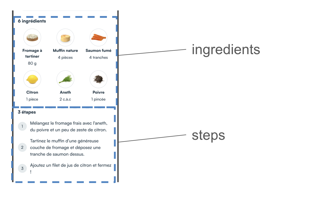
Ingredients
To create your own recipe detail ingredients template you create a class that implements Ingredients
- MyCustomRecipeDetailIngredients.kt
- example
import ai.mealz.sdk.components.recipeDetail.success.ingredients.Ingredients
import ai.mealz.sdk.components.recipeDetail.success.ingredients.IngredientsParameters


class MyCustomRecipeDetailIngredients:  Ingredients {

    @Composable
    override fun Content(params: IngredientsParameters) {
        // Your custom design here

    }
}
import ai.mealz.sdk.components.recipeDetail.success.ingredients.Ingredients
import ai.mealz.sdk.components.recipeDetail.success.ingredients.IngredientsParameters


class MyCustomRecipeDetailIngredients:  Ingredients {

    @Composable
    override fun Content(params: IngredientsParameters) {
       Column(Modifier.padding(vertical = 16.dp), horizontalAlignment = Alignment.CenterHorizontally) {
            Text(
                modifier = Modifier
                    .padding(horizontal = 16.dp)
                    .fillMaxWidth(),
                text = Localisation.recipe.numberOfIngredients(params.ingredients.size).localised,
                style = ai.mealz.sdk.theme.Typography.subtitleBold.copy(textAlign = TextAlign.Start),
                color = ai.mealz.sdk.theme.Colors.black
            )

            params.ingredients.groupBy { ceil(((params.ingredients.indexOf(it) + 1.0)) / 3.0) }.map { it.value }.forEach { row ->
                Row(
                    modifier = Modifier
                        .fillMaxWidth()
                        .padding(vertical = 16.dp),
                    horizontalArrangement = Arrangement.SpaceEvenly
                ) {
                    row.forEach {
                        Box(Modifier.weight(1f), contentAlignment = Alignment.Center) {
                            Ingredient(it, params.guestsCount, params.defaultRecipeGuest)
                        }
                    }
                    for (i in 3 - row.size downTo 1) {
                        Spacer(modifier = Modifier.weight(1f))
                    }
                }
            }
        }

    }

    @Composable
    fun Ingredient(ingredient: Ingredient, guestsCount: Int, defaultRecipeGuest: Int) {
        Column(
            horizontalAlignment = Alignment.CenterHorizontally
        ) {

            Surface(
                shape = RoundedCornerShape(32.dp),
                border = BorderStroke(1.dp, ai.mealz.sdk.theme.Colors.lightgrey)
            ) {
                if (ingredient.attributes?.pictureUrl.isNullOrEmpty()) {
                    Image(
                        painter = painterResource(miamDefaultIngredient),
                        contentDescription = "icon ingredient",
                        contentScale = ContentScale.Crop,
                        modifier = Modifier
                            .height(56.dp)
                            .width(56.dp)
                            .padding(4.dp)
                    )

                } else {
                    AsyncImage(
                        model = ingredient.attributes?.pictureUrl,
                        contentDescription = "icon ingredient",
                        contentScale = ContentScale.Crop,
                        modifier = Modifier
                            .height(56.dp)
                            .width(56.dp)
                            .padding(4.dp)
                    )
                }
            }
            Text(
                text = ingredient.attributes?.name?.replaceFirstChar { if (it.isLowerCase()) it.titlecase(Locale.ROOT) else it.toString() } ?: "",
                textAlign = TextAlign.Center,
                style = TextStyle(
                    fontSize = 14.sp,
                    lineHeight = 21.sp,
                    fontWeight = FontWeight(900),
                    color = ai.mealz.sdk.theme.Colors.boldText,
                    textAlign = TextAlign.Center,
                )
            )
            Text(
                text = QuantityFormatter.readableFloatNumber(
                    value = QuantityFormatter.realQuantities(
                        // Will never append ingredient must have a quantity
                        ingredient.attributes?.quantity ?: "1",
                        guestsCount,
                        // Will never append recipe must have a numberOfGuests
                        defaultRecipeGuest
                    ),
                    unit = ingredient.attributes?.unit
                ), textAlign = TextAlign.Center
            )
        }
    }
}
Ingredients params
data class IngredientsParameters(
    val ingredients: List<Ingredient>,
    val guestsCount: Int,
    val defaultRecipeGuest: Int
)
Ingredients resources
you can replace and reuse string resources if you want to take advantage of our internationalisation system ex : `Localisation.recipe.numberOfIngredients(INT).localised`
| Methods | Resource ID | Value Fr | Value Eng |
|---|---|---|---|
| numberOfIngredients(Int) | com_miam_recipe_number_of_ingredients | %d ingrédients | %d ingredients |
Steps
To create your own recipe detail Steps template you create a class that implements RecipeDetailSteps
- MyCustomRecipeDetailIngredients.kt
- example
import ai.mealz.sdk.components.recipeDetail.success.steps.RecipeDetailSteps
import ai.mealz.sdk.components.recipeDetail.success.steps.RecipeDetailStepsParamters


class MyCustomRecipeDetailSteps:  RecipeDetailSteps {

    @Composable
    override fun Content(params: RecipeDetailStepsParamters) {
        // Your custom design here

    }
}
import ai.mealz.sdk.components.recipeDetail.success.steps.RecipeDetailSteps
import ai.mealz.sdk.components.recipeDetail.success.steps.RecipeDetailStepsParamters


class MyCustomRecipeDetailSteps:  RecipeDetailSteps {

    @Composable
    override fun Content(params: RecipeDetailStepsParamters) {
        Column(
            modifier = Modifier
                .fillMaxSize()
                .padding(8.dp)
        ) {
            Text(
                text = Localisation.recipe.steps.localised,
                style = ai.mealz.sdk.theme.Typography.subtitleBold,
                color = ai.mealz.sdk.theme.Colors.black
            )
            params.steps.forEachIndexed { index, recipeStep ->
                recipeStep.attributes?.stepDescription?.let { description ->
                    Step(
                        index,
                        description
                    )
                }
            }
            Spacer(modifier = Modifier.padding(vertical = 50.dp))
        }
    }
     @Composable
    fun Step(stepNumber: Int, description: String) {
        Surface(Modifier.clip(RoundedCornerShape(16.dp))) {
            Row(
                horizontalArrangement = Arrangement.Start,
                verticalAlignment = Alignment.CenterVertically,
                modifier = Modifier
                    .fillMaxWidth()
                    .padding(vertical = 16.dp)
            ) {
                CircleChips((stepNumber + 1).toString())
                Text(
                    text = description,
                    fontSize = 16.sp,
                    modifier = Modifier
                        .weight(1F)
                        .padding(horizontal = 8.dp, vertical = 4.dp)

                )
            }
        }
    }
}
Steps params
data class RecipeDetailStepsParamters(
    val steps: List<RecipeStep>
)
Steps ressources
you can replace and reuse string ressources if you want to take advantage of our internationalisation system
ex : Localisation.recipe.steps.localised
| Name | Ressource ID | Value Fr | Value Eng |
|---|---|---|---|
| steps | com_miam_recipe_steps | Étapes | Steps |