Custom UI Components
Each page is customizable, especially the background, loader, & empty state. For the default Mealz background & empty, it is just a clear white background. For the default Loader, it just a blue progress loader.
Customizing components is easy, all you need to is pass your custom components, that implement the protocol, to the viewOptions parameter.
Background Example
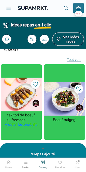
You would like to implement a new background, let's say just the color Pink.
First & foremost, you would create a SwiftUI struct that implements the Miam BackgroundProtocol.
import SwiftUI
import MealziOSSDK

@available(iOS 14, *)
public struct DemoBackgroundView: BackgroundProtocol {
    public init() {}
    public func content() -> some View {
        Color.pink
    }
}
Next, you would pass that component into the background of the baseViews.
To pass in your new view, you must pass it inside the TypeSafeBackground object first.
This is because each object needs to be known as run time, so to be to support defaults, we wrap our views in an instance of TypeSafe_.
This allows for full customizability while still supporting defaults.
Each view will have a corresponding TypeSafe_, & the name should correspond to the component (like Background).
let customBaseViews = BaseViewOptions( // pass new instance of BaseViewOptions
    background: TypeSafeBackground(DemoBackgroundView()) // wrap DemoBackgroundView() in TypeSafe
)
Next, we need to pass it to the Catalog Feature
- UIKit
- SwiftUI
import MealziOSSDK

let customBase = MealzBaseNavCoordinator.Constructor(
    navigationController: navController,
    baseViews: customBaseViews // your new base Views
)

MealPlannerFeatureNavCoordinator(
    baseConstructor: customBase
)
import MealziOSSDK

MealzCatalogFeatureSwiftUI(baseViews: customBaseViews)
Here is the result when we run our application.
If you want to see what options you have, you can read our documentation, or directly view the parameters in XCode documentation.
You can hold option & select on an object to see the parameters & definition.
For example:

Recipe Card Example
Let's look at a more complex example, a new RecipeCard for the Catalog View. The RecipeCard has data passed into it that you'll need to handle & work with.
CatalogRecipeCardProtocol
First & foremost, you would create a SwiftUI struct that implements the Miam CatalogRecipeCardProtocol.
This is the protocol:
/**
 A protocol defining the necessary parameters for the CatalogRecipeCard.

 - recipeCardDimensions: CGSize -> the width & height of the recipe card
 - recipe: Recipe -> The Recipe object of the current Recipe Card
 - isCurrentlyInBasket: Bool -> Boolean on whether the Recipe is currently in the basket. This can change the CTA text
 - onAddToBasket: (String) -> Void: A closure that executes the function in the "Call To Action" of the recipe card. This is usally "add to basket", so the navigation is to the Basket
 - onShowRecipeDetails: (String) -> Void: A closure that opens the RecipeDetails, passing in the recipeId

 */
@available(iOS 14, *)
public protocol CatalogRecipeCardProtocol {
    associatedtype Content: View
    @ViewBuilder func content(
        recipeCardDimensions: CGSize,
        recipe: Recipe,
        isCurrentlyInBasket: Bool,
        onAddToBasket: @escaping (String) -> Void,
        onShowRecipeDetails: @escaping (String) -> Void
    ) -> Content
}
Extend the protocol
To implement your own version, you'll just need to extend the protocol & conform to it by adding the content func.
import SwiftUI
import MealziOSSDK
import mealzcore // we need this as the Recipe object is defined in mealzcore

@available(iOS 14, *)
public struct DemoCatalogRecipeCardView: CatalogRecipeCardProtocol {
    public init() {}
    public func content(
        recipeCardDimensions: CGSize,
        recipe: Recipe,
        isCurrentlyInBasket: Bool,
        onAddToBasket: @escaping (String) -> Void,
        onShowRecipeDetails: @escaping (String) -> Void
    ) -> some View {
        EmptyView() // this will become your imp
    }
}
Let's add some content
Now, instead of showing an EmptyView, we should actually style our CatalogRecipeCard.
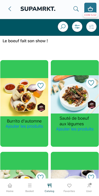
I've added a very simple implementation with a green background for reference:
@available(iOS 14, *)
public struct DemoCatalogRecipeCardView: CatalogRecipeCardProtocol {
    public init() {} // if your views are in separate package like ours, make sure you have a public init
    public func content(
        recipeCardDimensions: CGSize,
        recipe: Recipe,
        isCurrentlyInBasket: Bool,
        onAddToBasket: @escaping (String) -> Void,
        onShowRecipeDetails: @escaping (String) -> Void
    ) -> some View {
        VStack {
            ZStack(alignment: .topTrailing) { // image & like button
                AsyncImage(url: recipe.pictureURL) { image in
                    image
                        .resizable()
                        .aspectRatio(contentMode: .fill)
                        .frame(minWidth: 0, maxWidth: recipeCardDimensions.width, maxHeight: 150)
                }
                LikeButton( // there are other parameters you can change to customize
                    likeButtonInfo: LikeButtonInfo(recipeId: recipe.id)
                ).padding(10)
            }
            .frame(height: 150)
            Text(recipe.title)
                .lineLimit(2)
            if !isCurrentlyInBasket { // button to add to basket if not here
                Button {
                    onAddToBasket(recipe.id)
                } label: {
                    Text(Localization.recipe.add.localised)
                }
            }
        }
        .onTapGesture { onShowRecipeDetails(recipe.id) } // tap entire card to see details
        .frame(width: recipeCardDimensions.width, height: recipeCardDimensions.height)
        .background(Color.green).cornerRadius(10)
    }
}
Add it to our CatalogPackageRow on the CatalogView
Next, you would pass that component into the recipeCard of the CatalogPackageRowViewOptions for the CatalogFeature.
The CatalogPackageRowViewOptions is separate than the CatalogRecipesListViewOptions because we separate out the functionality of the overall page & showing the packages.
CatalogView shows packages while CatalogResults shows recipes list, so you'd need to implement a similar solution there in the CatalogRecipesListViewOptions.
To pass in your new view, you must pass it inside the TypeSafeCatalogRecipeCard object first, like we did previously with background.
struct MealzViewConfig {
    // other views
    static let catalogPackageView = CatalogPackageRowViewOptions(
        recipeCard: TypeSafeCatalogRecipeCard(DemoCatalogRecipeCardView())
    )
}
Then we make sure the catalogPackageView options are passed into our CatalogFeatureConstructor:
struct MealzViewConfig {
    // other views
        static let catalogConfig = CatalogFeatureConstructor(
        useMealPlanner: true // only if you want Meal Planner feature
//        usesPreferences: true,
//        baseViews: baseViews,
//        catalogViewOptions: catalogView,
//        recipesListViewOptions: recipesListView,
        packageRowViewOptions: catalogPackageView, // <--- this is what we add
//        catalogSearchViewOptions: catalogSearchView,
//        filtersViewOptions: filtersViewOptions,
//        preferencesViewOptions: preferencesViewOptions,
//        preferencesSearchViewOptions: preferencesSearchViewOptions,
//        catalogViewGridConfig: catalogViewGridConfig,
//        catalogResultsGridConfig: catalogResultsGridConfig
    )
}
& be sure that your CatalogFeature uses this custom CatalogFeatureConstructor that we just created:
feature = MealzCatalogFeatureUIKit(
    catalogFeatureConstructor: MealzViewConfig.catalogConfig, // <--- this is what we add
)
Here is the result when we run our application.
To see the full Catalog options, you can read here: Catalog Feature Customization.