ItemSelector customization
If you want to fully customize this component we recommend copying the code into your Mealz template configuration. You can remove the code you do not override.
itemSelector{
    header {
         view = MyCustomItemSelectorHeaderView()
    }
    search {
         view = MyCustomItemSelectorSearchView()
    }
    selectedItem{
         view = MyCustomItemSelectorItemSelectedView()
    }
    success {
        view = MyCustomItemSelectorSuccessView()
    }
    loading {
         view = MyCustomItemSelectorLoadingView()
    }
    empty {
         view = MyCustomItemSelectorEmptyView()
    }
}
class MiamTemplateManager {
    init {
        MiamTheme.Template
        {
         // <---- copy above code here
        }
    }
}
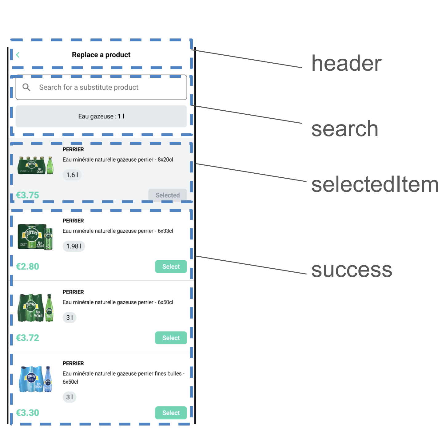
Header
The Header is the first customizable component on the ItemSelector at the very top of the page;
to create your own ItemSelector header you create a class that implements ItemSelectorHeader
- MyCustomItemSelectorHeader.kt
- example
import ai.mealz.sdk.components.itemSelector.header.ItemSelectorHeader
import ai.mealz.sdk.components.itemSelector.header.ItemSelectorHeaderParameters


class MyCustomItemSelectorHeader: ItemSelectorHeader {

    @Composable
    override fun Content(params: ItemSelectorHeaderParameters) {
        // Your custom design here

    }
}
import ai.mealz.sdk.components.itemSelector.header.ItemSelectorHeader
import ai.mealz.sdk.components.itemSelector.header.ItemSelectorHeaderParameters

class MyCustomItemSelectorHeader : ItemSelectorHeader {
    @Composable
    override fun Content(params: ItemSelectorHeaderParameters) {
        Box(modifier = Modifier.fillMaxWidth()) {
            IconButton(
                modifier = Modifier
                    .size(xlButtonHeight)
                    .align(Alignment.CenterStart),
                onClick = params.previous
            ) {
                Image(
                    colorFilter = ColorFilter.tint(ai.mealz.sdk.theme.Colors.primary),
                    painter = painterResource(ai.mealz.sdk.ressource.Image.toggleCaret),
                    contentDescription = "Previous",
                    modifier = Modifier.rotate(180f)
                )
            }
            Text(
                text = params.title,
                modifier = Modifier
                    .fillMaxWidth()
                    .align(Alignment.Center),
                textAlign = TextAlign.Center,
                style = TextStyle(fontSize = 16.sp, fontWeight = FontWeight.Bold)
            )
        }
    }
}
Header params
data class ItemSelectorHeaderParameters(
    val title: String,
    val previous: () -> Unit // back to previous page
)
Search
To create your own Search template you create a class that implements ItemSelectorSearch
- MyCustomItemSelectorHeader.kt
- example
import ai.mealz.sdk.components.itemSelector.search.ItemSelectorSearch
import ai.mealz.sdk.components.itemSelector.search.ItemSelectorSearchParameters


class MyCustomItemSelectorSearch: ItemSelectorSearch {

    @Composable
    override fun Content(params: ItemSelectorSearchParameters) {
        // Your custom design here

    }
}
import ai.mealz.sdk.components.itemSelector.search.ItemSelectorSearch
import ai.mealz.sdk.components.itemSelector.search.ItemSelectorSearchParameters

internal class MyCustomItemSelectorSearch: ItemSelectorSearch {
    @Composable
    override fun Content(params: ItemSelectorSearchParameters) {
        Column(Modifier.padding(vertical = 24.dp, horizontal = 16.dp), verticalArrangement = Arrangement.spacedBy(12.dp)) {
            SearchBar(params)
            if (params.ingredientName.isNotEmpty()) {
                IngredientInfo(params)
            }
        }
    }

    @Composable
    private fun SearchBar(params: ItemSelectorSearchParameters) {
        var textFieldValue by remember { mutableStateOf(TextFieldValue("")) }

        Row(
            Modifier
                .fillMaxWidth()
                .border(
                    border = BorderStroke(1.dp, ai.mealz.sdk.theme.Colors.grey),
                    shape = RoundedCornerShape(6.dp)
                ),
            verticalAlignment = Alignment.CenterVertically,
            horizontalArrangement = Arrangement.SpaceBetween
        ) {
            TextField(
                leadingIcon = { Icon(Icons.Filled.Search, "Search icon") },
                trailingIcon = {
                    if (textFieldValue.text.isNotEmpty()) {
                        Icon(
                            Icons.Filled.Close, "Close icon",
                            Modifier.clickable { textFieldValue = textFieldValue.copy(text = "") }
                        )
                    }
                },
                value = textFieldValue,
                onValueChange = {
                    textFieldValue = it
                    params.onChanges(it.text)
                },
                colors = TextFieldDefaults.textFieldColors(
                    disabledTextColor = Color.Transparent,
                    backgroundColor = Color.White,
                    focusedIndicatorColor = Color.Transparent,
                    unfocusedIndicatorColor = Color.Transparent,
                    disabledIndicatorColor = Color.Transparent
                ),
                placeholder = {
                    Text(
                        params.searchPlaceholder,
                        style = TextStyle(fontSize = 16.sp),
                        maxLines = 1,
                        overflow = TextOverflow.Ellipsis
                    )
                },
                singleLine = true,
                modifier = Modifier.weight(1f)
            )
        }
    }

    @Composable
    private fun IngredientInfo(params: ItemSelectorSearchParameters) {
        Surface(
            shape = RoundedCornerShape(6.dp),
            color = ai.mealz.sdk.theme.Colors.backgroundSecondary,
            modifier = Modifier.fillMaxWidth()
        ) {
            Row(
                horizontalArrangement = Arrangement.Center,
                modifier = Modifier
                    .fillMaxWidth()
                    .padding(16.dp)
            ) {
                Text(
                    text = "${params.ingredientName.replaceFirstChar { if (it.isLowerCase()) it.titlecase(Locale.ROOT) else it.toString() }} :",
                    style = TextStyle(fontSize = 14.sp)
                )
                Spacer(Modifier.width(2.dp))
                Text(
                    text = "${params.ingredientQuantity} ${params.ingredientUnit}",
                    style = TextStyle(fontSize = 14.sp, fontWeight = FontWeight.Black)
                )
            }
        }
    }
}
Search params
data class ItemSelectorSearchParameters(
    val ingredientName: String, // current ingredient needed in recipe to replace
    val ingredientQuantity: Int, // current ingredient needed quantity in recipe
    val ingredientUnit: String, // current ingredient unit (litre , grammes ...)
    val searchPlaceholder: String,
    val onChanges: (String) -> Unit
)
Selected Item
To create your own Search template you create a class that implements ItemSelectorSearch
- MyCustomItemSelectorHeader.kt
- example
import ai.mealz.sdk.components.itemSelector.selectedItem.ItemSelectorSelectedItem
import ai.mealz.sdk.components.itemSelector.selectedItem.ItemSelectorSelectedItemParameters


class MyCustomItemSelectorSelected: ItemSelectorSelectedItem {

    @Composable
    override fun Content(params: ItemSelectorSelectedItemParameters) {
        // Your custom design here

    }
}
import ai.mealz.sdk.components.itemSelector.selectedItem.ItemSelectorSelectedItem
import ai.mealz.sdk.components.itemSelector.selectedItem.ItemSelectorSelectedItemParameters

class MyCustomItemSelectorSelected: ItemSelectorSelectedItem {
    @Composable
    override fun Content(params: ItemSelectorSelectedItemParameters) {
        val item = params.selectedItem
        Column {
            Surface(color = backgroundLightGrey, modifier = Modifier.fillMaxWidth()) {
                Column(modifier = Modifier.padding(16.dp), verticalArrangement = Arrangement.spacedBy(8.dp)) {
                    Row(horizontalArrangement = Arrangement.spacedBy(16.dp)) {
                        AsyncImage(
                            model = item.attributes?.image ?: "",
                            contentDescription = "Product image",
                            contentScale = ContentScale.Crop,
                            modifier = Modifier
                                .size(88.dp)
                                .padding(4.dp)
                                .fillMaxSize()
                        )
                        Column(verticalArrangement = Arrangement.spacedBy(4.dp)) {
                            item.attributes?.brand?.let { name ->
                                Text(
                                    text = name.uppercase(),
                                    fontSize = 12.sp,
                                    fontWeight = FontWeight.Bold,
                                    lineHeight = 18.sp,
                                )
                            }
                            item.attributes?.name?.let { itemDescription ->
                                Text(
                                    text = itemDescription,
                                    fontSize = 12.sp,
                                    lineHeight = 18.sp
                                )
                            }
                            Badge(item.capacity)
                        }
                    }
                    Row(
                        verticalAlignment = Alignment.CenterVertically,
                        horizontalArrangement = Arrangement.SpaceBetween,
                        modifier = Modifier.fillMaxWidth()
                    ) {
                        Text(
                            text = item.attributes?.unitPrice?.toDouble()?.formatPrice() ?: "",
                            fontSize = 20.sp,
                            fontWeight = FontWeight.Black,
                            lineHeight = 24.sp,
                            color = ai.mealz.sdk.theme.Colors.primary,
                            textAlign = TextAlign.Center
                        )
                        DisabledButton()
                    }
                }
            }
            Surface(color = border, modifier = Modifier.fillMaxWidth()) {
                Spacer(Modifier.size(1.dp))
            }
        }
    }

    @Composable
    private fun Badge(text: String) {
        Surface(
            color = backgroundSecondary,
            modifier = Modifier.padding(top = 8.dp),
            shape = RoundedCornerShape(50)
        ) {
            Text(text = text, modifier = Modifier.padding(vertical = 4.dp, horizontal = 8.dp))
        }
    }

    @Composable
    private fun DisabledButton() {
        Surface(shape = RoundedCornerShape(6.dp), color = border) {
            Text(
                text = Localisation.itemSelector.selected.localised,
                fontSize = 14.sp,
                fontWeight = FontWeight.Bold,
                lineHeight = 16.sp,
                color = disabledText,
                modifier = Modifier.padding(vertical = 6.dp, horizontal = 16.dp)
            )
        }
    }
}
Selected Item params
data class ItemSelectorSelectedItemParameters(
    @Deprecated("Use other parameters instead")
    val selectedItem: Item, // contains all the information but will not be maintained
    val name: String,
    val brand: String,
    val imageUrl: String,
    val description: String,
    val price : Double,
)
Selected Item resources
you can replace and reuse string resources if you want to take advantage of our internationalisation system ex : Localisation.itemSelector.selected.localised
| Name | Resource ID | Value Fr | Value Eng |
|---|---|---|---|
| selected | com_miam_item_selector_selected | Sélectionné | Selected |
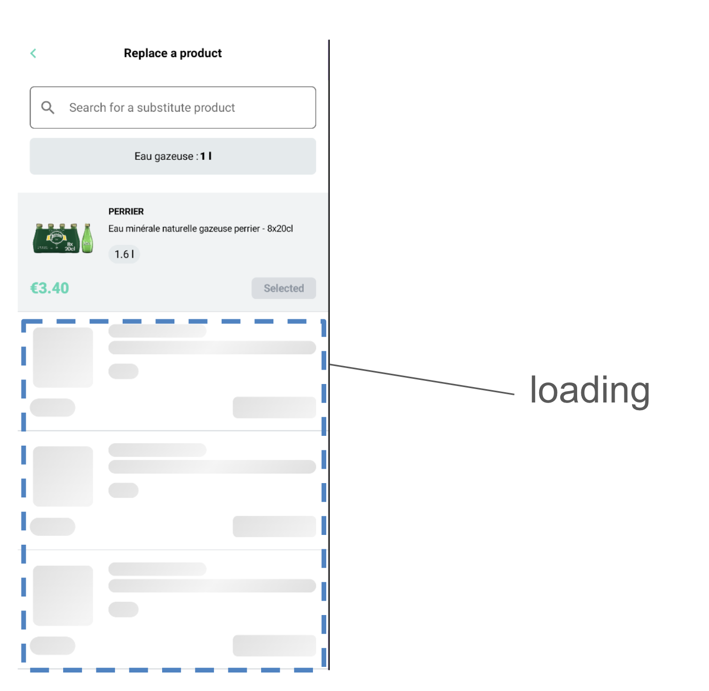
Loading
To create your own itemSelector loading template create a class that implements ItemSelectorLoading
- MyCustomItemSelectorHeader.kt
- example
import ai.mealz.sdk.components.itemSelector.loading.ItemSelectorLoading


class MyCustomItemSelectorHeader: ItemSelectorLoading {

    @Composable
    override fun Content() {
        // Your custom design here

    }
}
import ai.mealz.sdk.components.itemSelector.loading.ItemSelectorLoading

class MyCustomItemSelectorHeader : ItemSelectorLoading {
    @Composable
    override fun Content() {
        for (i in 0..3) {
            SkeletonLoader {
                ShimmerItem(it)
            }
        }
    }
}

@Composable
fun ShimmerItem(brush: Brush) {
    Column {
        Surface(modifier = Modifier.fillMaxWidth()) {
            Column(modifier = Modifier.padding(16.dp), verticalArrangement = Arrangement.spacedBy(8.dp)) {
                Row(horizontalArrangement = Arrangement.spacedBy(16.dp)) {
                    Spacer(
                        modifier = Modifier
                            .size(88.dp)
                            .padding(4.dp)
                            .fillMaxSize()
                            .clip(RoundedCornerShape(8.dp))
                            .background(brush = brush)
                    )
                    Column(verticalArrangement = Arrangement.spacedBy(4.dp)) {
                        Spacer(
                            modifier = Modifier
                                .height(18.dp)
                                .width(130.dp)
                                .clip(RoundedCornerShape(100))
                                .background(brush = brush)
                        )
                        Spacer(
                            modifier = Modifier
                                .height(18.dp)
                                .fillMaxWidth()
                                .clip(RoundedCornerShape(100))
                                .background(brush = brush)
                        )
                        Spacer(
                            modifier = Modifier
                                .padding(top = 8.dp)
                                .height(20.dp)
                                .width(40.dp)
                                .clip(RoundedCornerShape(100))
                                .background(brush = brush)
                        )
                    }
                }
                Row(
                    verticalAlignment = Alignment.CenterVertically,
                    horizontalArrangement = Arrangement.SpaceBetween,
                    modifier = Modifier.fillMaxWidth()
                ) {
                    Spacer(
                        modifier = Modifier
                            .height(24.dp)
                            .width(60.dp)
                            .clip(RoundedCornerShape(100))
                            .background(brush = brush)
                    )
                    Spacer(
                        modifier = Modifier
                            .height(28.dp)
                            .width(110.dp)
                            .clip(RoundedCornerShape(6.dp))
                            .background(brush = brush)
                    )
                }
            }
        }
        Surface(color = ai.mealz.sdk.theme.Colors.border, modifier = Modifier.fillMaxWidth()) {
            Spacer(Modifier.size(1.dp))
        }
    }
}
Success
To create your own Success template you create a class that implements ItemSelectorSuccess
- MyCustomItemSelectorHeader.kt
- example
import ai.mealz.sdk.components.itemSelector.success.ItemSelectorSuccess
import ai.mealz.sdk.components.itemSelector.success.ItemSelectorSuccessParameters


class MyCustomItemSelectorSuccess: ItemSelectorSuccess {

    @Composable
    override fun Content(params: ItemSelectorSearchParameters) {
        // Your custom design here

    }
}
import ai.mealz.sdk.components.itemSelector.success.ItemSelectorSuccess
import ai.mealz.sdk.components.itemSelector.success.ItemSelectorSuccessParameters

class MyCustomItemSelectorSuccess: ItemSelectorSuccess {

    @Composable
    override fun Content(params: ItemSelectorSuccessParameters) {
        Column(
            modifier = Modifier.fillMaxSize()
        ) {
            params.items.forEach { item -> SelectableItem(item, params.select) }
        }
    }

    @Composable
    private fun SelectableItem(selectableItem: Item, select: (pricedItem: Item) -> Unit) {
        Column {
            Surface(modifier = Modifier.fillMaxWidth()) {
                Column(modifier = Modifier.padding(16.dp), verticalArrangement = Arrangement.spacedBy(8.dp)) {
                    Row(horizontalArrangement = Arrangement.spacedBy(16.dp)) {
                        AsyncImage(
                            model = selectableItem.attributes?.image ?: "",
                            contentDescription = "Product image",
                            contentScale = ContentScale.Crop,
                            modifier = Modifier
                                .size(88.dp)
                                .padding(4.dp)
                                .fillMaxSize()
                        )
                        Column(verticalArrangement = Arrangement.spacedBy(4.dp)) {
                            selectableItem.attributes?.brand?.let { name ->
                                Text(
                                    text = name.uppercase(),
                                    fontSize = 12.sp,
                                    fontWeight = FontWeight.Bold,
                                    lineHeight = 18.sp,
                                )
                            }
                            selectableItem.attributes?.name?.let { name ->
                                Text(
                                    text = name,
                                    fontSize = 12.sp,
                                    lineHeight = 18.sp
                                )
                            }
                            Badge(selectableItem.capacity)
                        }
                    }
                    Row(
                        verticalAlignment = Alignment.CenterVertically,
                        horizontalArrangement = Arrangement.SpaceBetween,
                        modifier = Modifier.fillMaxWidth()
                    ) {
                        Text(
                            text = selectableItem.attributes?.unitPrice?.toDouble()?.formatPrice() ?: "",
                            fontSize = 20.sp,
                            fontWeight = FontWeight.Black,
                            lineHeight = 24.sp,
                            color = ai.mealz.sdk.theme.Colors.primary,
                            textAlign = TextAlign.Center
                        )
                        PrimaryButton(selectableItem, select)
                    }
                }
            }
            Surface(color = border, modifier = Modifier.fillMaxWidth()) {
                Spacer(Modifier.size(1.dp))
            }
        }
    }

    @Composable
    private fun Badge(text: String) {
        Surface(
            color = backgroundSecondary,
            modifier = Modifier.padding(top = 8.dp),
            shape = RoundedCornerShape(50)
        ) {
            Text(text = text, modifier = Modifier.padding(vertical = 4.dp, horizontal = 8.dp))
        }
    }

    @Composable
    private fun PrimaryButton(selectableItem: Item, select: (item: Item) -> Unit) {
        Surface(shape = RoundedCornerShape(6.dp), color = primary, modifier = Modifier.clickable { select(selectableItem) }) {
            Text(
                text = Localisation.itemSelector.select.localised,
                fontSize = 14.sp,
                fontWeight = FontWeight.Bold,
                lineHeight = 16.sp,
                color = white,
                modifier = Modifier.padding(vertical = 6.dp, horizontal = 16.dp)
            )
        }
    }
}s
Success params
data class ItemSelectorSuccessItem(
    val name: String,
    val brand: String,
    val imageUrl: String,
    val description: String,
    val price : Double
)

data class ItemSelectorSuccessParameters(
    @Deprecated("Use itemSelectorItems instead")
    val items: List<Item>,
    val itemSelectorItems: List<ItemSelectorSuccessItem>,
    val previous: () -> Unit,
    val select: (Item) -> Unit
)
Success resource
you can replace and reuse string resources if you want to take advantage of our internationalisation system ex : Localisation.itemSelector.select.localised
| Name | Resource ID | Value Fr | Value Eng |
|---|---|---|---|
| select | com_miam_item_selector_select | Sélectionner | Select |
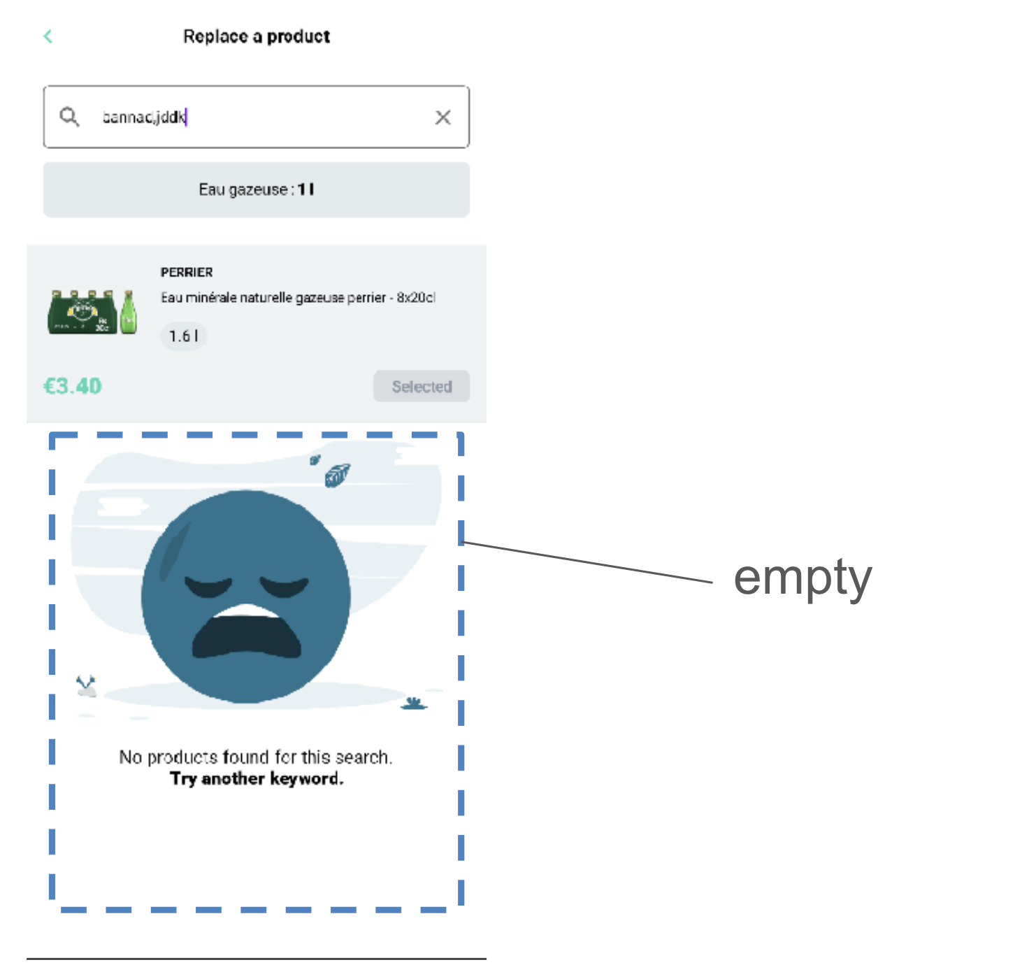
Empty
Item selelector is using default Empty page view
Empty resource
Resource are passed in thanks to title and subtitle field in EmptyParameters
you can replace and reuse string resources if you want to take advantage of our internationalisation system ex : Localisation.itemSelector.notFoundTitle.localised
| Name | Resource ID | Value Fr | Value Eng |
|---|---|---|---|
| notFoundTitle | com_miam_item_selector_not_found_title | Aucun produits trouvés pour cette recherche. | No products found for this search. |
| noSubstitution | com_miam_item_selector_no_substitution | Aucun produits de substitution trouvés | No substitute products found |
| notFoundSubtitle | com_miam_item_selector_not_found_subtitle | Essayez avec un autre mot-clé. | Try another keyword. |