Custom UI Components
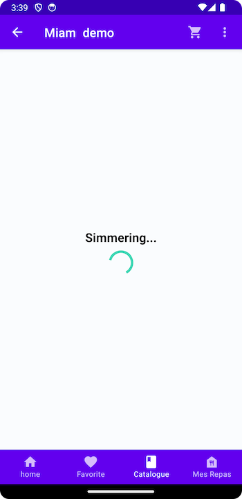
Each page is customizable, especially the loader & empty state. For the default Mealz background & empty, it is just a clear white background. For the default Loader, it just a blue progress loader.
Customizing components is easy, all you need to is pass your custom components, that implement the protocol, to the viewOptions parameter.
Loader Example
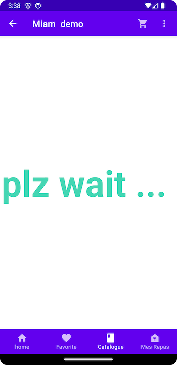
You would like to implement a new Loader, let's say just with simple text.
First & foremost, you would create a Jetpack Compose View that implements the Mealz Loader.
import androidx.compose.material.Text
import androidx.compose.runtime.Composable
import com.miam.sdk.components.baseComponent.loader.Loader
import com.miam.sdk.components.baseComponent.loader.LoaderParameters

class CustomLoader: Loader {
    @Composable
    override fun Content(params: LoaderParameters) {
        Box(
            modifier = Modifier.fillMaxSize(),
            contentAlignment = Alignment.Center
        ) {
            Text(
                text = "plz wait ... ",
                style = Typography.h1.copy(fontWeight = FontWeight.Bold),
                color = Colors.primary
            )
        }
    }
}
in this case, LoaderParameters does not expect anything passed in
object LoaderParameters
Add it to our MealzTemplateManager
Next, you would pass that component into the view of the loader for the catalog.
class MealzTemplateManager {
    init {
        Colors.primary = Color(0xFF44D6B3)
        MiamTheme.Template {
            catalog {
                loader {
                    view = CustomLoader()
                }
            }
Here is the result when we run our application.
If you want to see what options you have, you can read our documentation, or directly view the parameters in Android documentation.
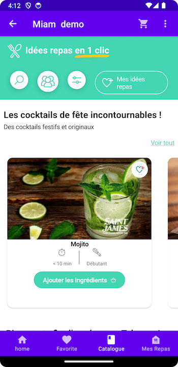
Recipe Card Example
Let's look at a more complex example, a new RecipeCard for the Catalog View. The RecipeCard has data passed into it that you'll need to handle & work with.
RecipeCardSuccess
First & foremost, you would create a Jetpack Compose view that implements the Mealz RecipeCardSuccess.
More importantly, you'll need the RecipeCardSuccessParameters
/**
 A protocol defining the necessary parameters for the CatalogRecipeCard.

 - recipe: Recipe -> The Recipe object of the current Recipe Card
 - isInShelve: Boolean -> Boolean on whether the Recipe is currently in the search results (instead of catalog)
 - goToDetail: () -> Void: A closure that opens the RecipeDetails
 - goToPreview: () -> Void: A closure that opens that Basket Preview to see the ingredients
 - addRecipe: () -> Void: A closure that executes the function in the "Call To Action" of the recipe card. This is usally "add to basket", so the navigation is to the Basket
 - isInCart: Boolean -> Boolean on whether the Recipe is currently in the basket. This can change the CTA text
 - likeIsEnabled: Boolean -> Boolean on whether the recipe card should show the like button

 */
data class RecipeCardSuccessParams(
    val recipe: Recipe,
    val isInShelve: Boolean,
    val goToDetail: () -> Unit,
    val goToPreview: () -> Unit,
    val addRecipe: () -> Unit,
    val isInCart: Boolean,
    val likeIsEnabled: Boolean
)
Implement the interface
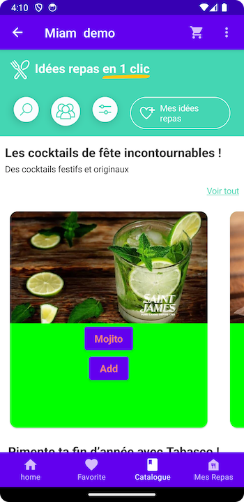
To implement your own version, you'll just need to extend RecipeCardSuccess & conform to it by adding the RecipeCardSuccessParams.
Instead of showing an EmptyView, we should actually style our RecipeCardSuccess.
I've added a very simple implementation with a green background for reference:
class CustomRecipeCardSuccess: RecipeCardSuccess {
    @Composable
    override fun Content(params: RecipeCardSuccessParams) {
        Column {
            Card(
                modifier = Modifier
                    .fillMaxSize()
                    .padding(Dimension.lPadding),
                shape = RoundedCornerShape(12.dp)
            ) {
                Column(
                    horizontalAlignment = Alignment.CenterHorizontally,
                    modifier = Modifier.height(330.dp)
                        .background(Color.Green)
                ) {
                    // relative container
                    Box {
                        params.recipe.attributes?.let {
                            RecipeCardImageView(it.mediaUrl) {
                                params.goToDetail()
                            }
                        }
                    }
                    params.recipe.attributes?.let {
                        Button(onClick = { params.goToDetail() }) {
                            Text(
                                text = it.title,
                                style = Typography.body.copy(fontWeight = FontWeight.Bold),
                                color = Colors.danger
                            )
                        }
                    }
                    Button(onClick = {
                        if (params.isInCart) {
                            params.goToDetail
                        } else {
                            params.addRecipe()
                            params.goToPreview()
                        }
                    }) {
                        Text(
                            text = if (params.isInCart) "See Details" else "Add",
                            style = Typography.body.copy(fontWeight = FontWeight.Bold),
                            color = Colors.danger
                        )
                    }
                }
            }
        }
    }
}
Add it to our MealzTemplateManager
Next, you would pass that component into the view of the success for the recipeCard.
class MealzTemplateManager {
    init {
        MiamTheme.Template {
            recipeCard {
                success {
                    view = CustomRecipeCardSuccess()
                }
            }
Here is the result when we run our application.