Customize base component views
Basic components are available through the SDK. The aim is to save time by overriding a template once and reusing it without further configuration.
Each page & template is fully customizable to your brand's design. All Template slote are optional, there are Mealz defaults for each view.
To understand how to create a custom component, you can read here.
We recommend putting all of your custom Templates into a custom module, then configure mealz in a configClass
In our sample implementations, we have one class MealzTemplateManager
class MealzTemplateManager {
    init {
        MiamTheme.Template {
            // the below View class go here
        }
}
Ingredients
There are 7 different components that you can override once and will be reused throughout the SDK
Small components
Counter
The Counter Component shows in several component sush as:
Products, RecipeDetail, Preferences
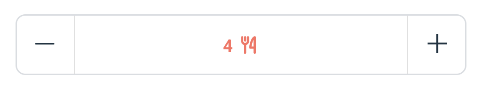
In Order to create your own counter you have to create class that implement Counter
import ai.mealz.sdk.components.baseComponent.counter.Counter
import ai.mealz.sdk.components.baseComponent.counter.CounterParameters

class MyCustomCounter: Counter {

     @Composable
    override fun Content(params: CounterParameters) {
        // Your custom design here
    }
}
Then you can use all arguments we give you thinks to CounterParameters
class CounterParameters(
    val initialCount: Int?, // initial counter state
    val isDisable: Boolean = false, // Will be true when counter button need to be disable
    val onCounterChanged: (newValue: Int) -> Unit, // to call when counter value change
    val lightMode: Boolean = false, // deprecated
    val minValue: Int? = null, // value under which you should not go
    val maxValue: Int? = null, // value above witch you should not go
    val isLoading: Boolean = false, // should show a loding staus of counter
    val key: Any? = null // provide an unique key to avoid compose recomposition mistake
)
Final step is to set Template in your template configuration:
class MealzTemplateManager {
    init {
        MiamTheme.Template {
            defaultViews {
                counter {
                    view = MyCustomCounter()
                }
            }
        }
    }
}
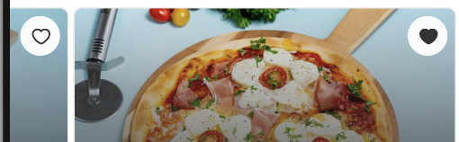
LikeButton
The Like Component shows in several component sush as:
RecipeCard, RecipeDetail
Like button have two sub templates loading and success
LikeButtonLoading
When a user clicks on the like button an API call is launched. To prevent user interaction we put the like button in loading state.
To override this loading state you have to create class that implement LikeButtonLoading
import ai.mealz.sdk.components.baseComponent.likeButton.loading.LikeButtonLoading


class MyLikeButtonLoading: LikeButtonLoading {

     @Composable
    override fun Content() {
        // Your custom design here
    }
}
There is no parameter in like button loading Content fonction
Fetching or updating the like status is quick so in order to avoid flickering we recommand making this view the same or similar to the isLiked View.
LikeButtonSuccess
When data has been fetched you can override LikeButtonSuccess
import ai.mealz.sdk.components.baseComponent.likeButton.success.LikeButtonSuccess
import ai.mealz.sdk.components.baseComponent.likeButton.success.LikeButtonSuccessParameters


class MyLikeButtonSuccess: LikeButtonSuccess {

     @Composable
    override fun Content(params: LikeButtonSuccessParameters) {
        // Your custom design here
    }
}
with
data class LikeButtonSuccessParameters(
    val isLiked: Boolean, // like or not
    val backgroundShape: Shape = CircleShape, // deprecated
    val likeAction: () -> Unit // to call on click
)
LikeButton all together
Final step is to set Template in your template configuration:
class MealzTemplateManager {
    init {
        MiamTheme.Template {
            defaultViews {
                likeButton {
                    success {
                        view = MyLikeButtonSuccess()
                    }
                    loading {
                        view = MyLikeButtonLoading()
                    }
                }
            }
        }
    }
}
MyMealButton
The MyMealButton is currently only used in the main catalog page.
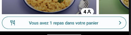
MyMealButton has two customizable parts: an empty state and a success state
MyMealButtonEmpty
When there is no recipe in Mealz basket we are in empty state
In our default Template empty my meal button is a empty Box in order to hide it
If you want to have your custom my meal button empty state create a class that implement MyMealButtonEmpty
import ai.mealz.sdk.components.baseComponent.myMealButton.empty.MyMealButtonEmpty


class MyMyMealButtonEmpty: MyMealButtonEmpty {

     @Composable
    override fun Content() {
        // Your custom design here
    }
}
There is no parameter in my meal button Content fonction
MyMealButtonSuccess
My Meal button is in success state as soon as a recipe is in mealz basket
If you want to have your custom my meal button success state create a class that implement MyMealButtonSuccess
import ai.mealz.sdk.components.baseComponent.myMealButton.success.MyMealButtonSuccess
import ai.mealz.sdk.components.baseComponent.myMealButton.success.MyMealButtonSuccessParameters


class MyMyMealButtonSuccess: MyMealButtonSuccess {

     @Composable
    override fun Content(params: MyMealButtonSuccessParameters) {
        // Your custom design here
    }
}
with
data class MyMealButtonSuccessParameters(
    val recipeCount: Int, // number or recipe in mealz basket
    val onClick: () -> Unit // on click action that should redirect to My meal
)
MyMealButton all together
Final step is to set Template in your template configuration:
class MealzTemplateManager {
    init {
        MiamTheme.Template {
            defaultViews {
                myMealButton {
                    success {
                        view = MyMyMealButtonSuccess()
                    }
                    empty {
                        view = MyMyMealButtonEmpty()
                    }
                }
            }
        }
    }
}
You are not forced to override all available templates. You can override the empty state if you wish to.
Page States
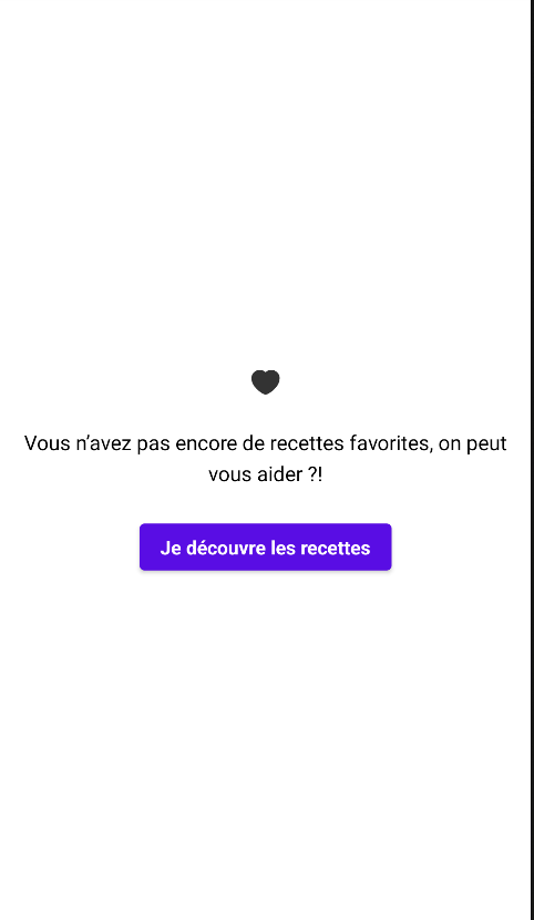
Empty
The Empty Component shows in several component sush as:
Catalog, MyMeal, MyProducts, Preferences, PreferenceSearch, ItemSelector, Favorite, SponsorDetail
Note that the template may be the same but the existence of the button depends on the parent component.
In Order to create your own empty state you have to create class that implement EmptyPage
import ai.mealz.sdk.components.baseComponent.emptyPage.EmptyPage
import ai.mealz.sdk.components.baseComponent.emptyPage.EmptyPageParameters


class MyCustomEmptyView: EmptyPage {

     @Composable
    override fun Content(params: EmptyPageParameters) {
        // Your custom design here
    }
}
Then you can use all arguments we give you thinks to EmptyPageParameters
data class EmptyPageParameters(
    val title: String, // Top sentence
    val subtitle: String = "", // optional sub sentence
    val haveAnAction: Boolean = false, // show CTA or not
    val image: Int = miamEmpty,
    val actionText: String = "", // CTA text
    val action: () -> Unit = {} // onClick on CTA
)
Final step is to set Template in your template configuration:
class MealzTemplateManager {
    init {
        MiamTheme.Template {
            defaultViews {
                empty {
                    view = MyCustomEmptyView()
                }
             }
        }
    }
}
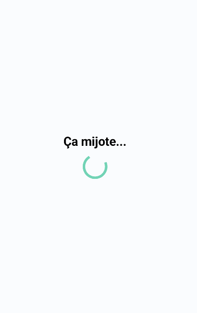
Loading
The Loader Component shows in several component such as:
MyMeal, MyProduct, Catalog, Favorite, BasketPreview, Preference, PreferenceSearch, RecipeDetail, SponsorDetail
In Order to create your own loading state you have to create class that implement Loader
import ai.mealz.sdk.components.baseComponent.loader.Loader
import ai.mealz.sdk.components.baseComponent.loader.LoaderParameters


class MyCustomLoadingView: Loader {

     @Composable
    override fun Content(params: LoaderParameters) {
        // Your custom design here
    }
}
LoaderParameters is an empty object for now, but tomorrow we'll be able to add properties to it, in order to avoid breaking changes in future versions.
object LoaderParameters
Final step is to set Template in your template configuration:
class MealzTemplateManager {
    init {
        MiamTheme.Template {
            defaultViews {
                loading {
                    view = MyCustomLoadingView()
                }
            }
        }
    }
}