Styling
Overriding style properties
You can globally customize styles by overiding some classes it will be applied to all components. There severale type of properi that can be override Colors, Wording, Typography, Icons / Images and Dimentions
Colors
Colors can be globally overriden by redefining them in your main assets file.
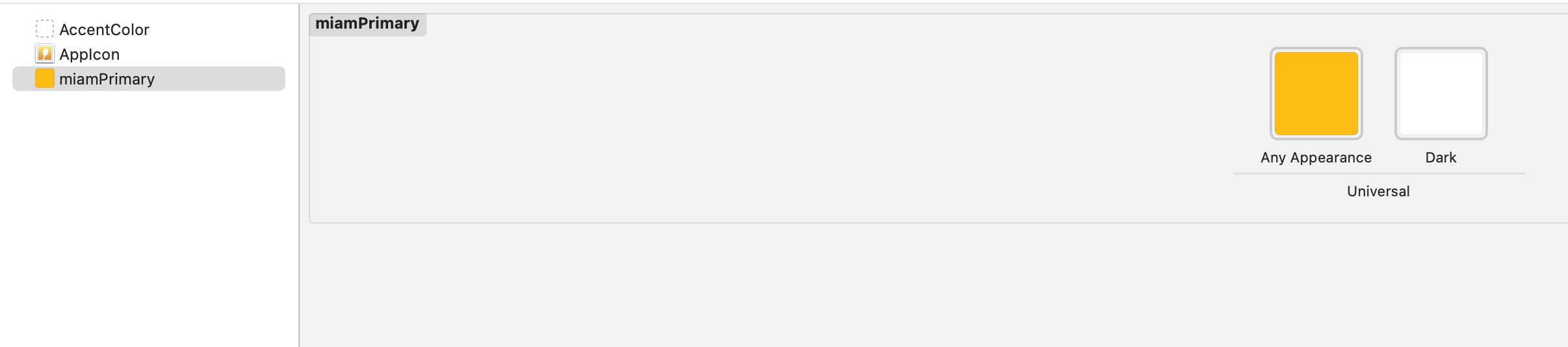
Exhaustive color list and default values 👇
| Name | Default value |
|---|---|
| miamBlack | #252525 |
| miamBlack20 | #202020 |
| miamBorder | #DDDDDD |
| miamBorderLight | #E9E9E9 |
| miamDanger | #F47F7A |
| miamGrey | #676767 |
| miamGreySurface | #EDEDED |
| miamInfo | #44D6B3 |
| miamLightGrey | #9F9F9F |
| miamMusterd | #FFC700 |
| miamNeutralGrey | #575756 |
| miamPrimary | #037E92 |
| miamPrimaryDark | #005562 |
| miamPrimaryLight | #BED5DC |
| miamPrimaryLighter | #F3F9FA |
| miamPrimaryText | #007E92 |
| miamSecondary | #E61845 |
| miamSecondaryText | #4B555D |
| miamSuccess | #44D6B3 |
| miamTernary | #209B8F |
| miamUnpureWhite | #FEFEFE |
| miamWarning | #FFDAA3 |
| miamWhite | #FAFCFE |
Wording
There is two way to override Text in the SDK
- By assigning a new value to MiamText (deprecated)
- By using I18n resolver (recommended)
Using MiamText
MiamText.sharedInstance.alreadyInCart = "ok done"
Icons / Images
Icons can be globally overriden by redefining them in your main assets file.
Exhaustive icon list and default values 👇
| Name | Default icon |
|---|
Dimensions
Templating
You can provide your own swiftUi template and map it with our controller All cutomizable elements are availables in theme/Template.swift
Template.sharedInstance.counterTemplate =
        {(count: Int,
          increase: @escaping () -> Void,
          decrease: @escaping () -> Void ) -> AnyView in
            AnyView(
               HStack{
                   Button(action: {
                       decrease()
                   }) {
                       Image(systemName: "minus.circle.fill").foregroundColor(.red)
                   }
                   Text(String(count))
                   Button(action: {
                       increase()
                   }) {
                       Image(systemName: "plus.circle").foregroundColor(.blue)
                   }
                }
          )}
New templating system
Starting in version 4.0.0 we will progressively be moving away from the Template singleton. It will be replaced by protocols that you will need to implement.
All views used in the meal planner are implemented using the new templating system.
| Protocol | Used to |
|---|---|
| MealPlannerCallToAction | Replace the content of the button used on homepage or lists to access the meal planner |
| MealPlannerForm | Replace the content of the form used to specify your budget in the meal planner |
| MealPlannerSuccess | Replace the content of the meal planner results view |
| MealPlannerEmpty | Replace the content of meal planner view when there are no results |
| MealPlannerFooter | Replace the footer in meal planner view |
| MealPlannerLoading | Replace the loader in meal planner view |
| MealPlannerToolbar | Replace the toolbar in meal planner view |
| MealPlannerRecap | Replace the content of meal planner recap view |
| MealPlannerRecipeCard | Replace the content of meal planner recipe card view |
| MealPlannerRecipeCardLoading | Replace the loader in meal planner recipe card view |
| MealPlannerRecipePlaceholder | Replace the content of meal planner recipe card view when there's no recipe |
| MealPlannerSearch | Replace the content of |
| MealPlannerBasketPreviewEmpty | Replace the content of meal planner basket preview view when the basket is empty |
| MealPlannerBasketPreviewLoading | Replace the content of meal planner basket preview view when the basket is loading |
| MealPlannerBasketPreviewProduct | Replace the product's information in meal planner basket preview view |
| MealPlannerBasketPreviewRecipeOverview | Replace recipe details' content in meal planner basket preview view |
| MealPlannerBasketPreviewSectionTitle | Replace a section title in meal planner basket preview view |
| MealPlannerBasketPreviewFooter | Replace the footer in meal planner basket preview view |
| MealPlannerBaskletPreviewSectionProduct | Replace a not yet in basket product's information in meal planner basket preview view |